Quick Tips for Visualising Data
Examples from the COVID-19 Pandemic
Created by OCHA's Centre for Humanitarian Data / @humdata
Press right on your keyboard or swipe right to navigate.


The choices we make when we visualise data influence how people see, understand, and react to the underlying data.
This session includes a series of slides to build your knowledge, a set of five short videos to demonstrate creating a graph and a short quiz to test your knowledge. The expected length of time to complete all segments is 25 minutes.
In this introductory session to visualising data using examples from the COVID-19 pandemic, you will learn:
- best practices for designing thoughtful data visualisations;
- how to identify and visually represent different relationships in data; and
- how to prepare and structure your data in order to make a simple line graph.
03: Choose the Right Visualisation
The progress bar at the bottom of your screen lets you know where you are in the session. If you would like to skip through the pages, you can do this using the navigation menu at the bottom left of your screen.
Each page introduces a tip, concept or best practice for visualising data during the COVID-19 pandemic. Scroll through the pages using your keyboard or by clicking on the right and left arrows at the bottom right of your screen.
On certain pages, there is the option to scroll down to learn more about a particular topic. Navigate to these vertical pages using the down arrow on your keyboard or by clicking on the down arrow at the bottom right of your screen.
Press down to learn more about navigating the session.
The navigation arrows at the bottom right of your screen are there to lead you through the session. In the example below, the left faded arrow indicates completed pages whereas both the down arrow and right arrow indicate pages you have yet to visit.

Now that you understand how to navigate this session, click on the right arrow to start the session.
Why We Visualise Data
We Visualise to Explore & Explain
We visualise data to explore it. Through exploratory data visualisation, we are able to uncover different relationships and to discover the most meaningful information to highlight or analyse further.
We also visualise data to explain what we are seeing in it. Explanatory visualisation can be used to inform, persuade and engage an audience. This is the type of visualisation we are going to focus on here.
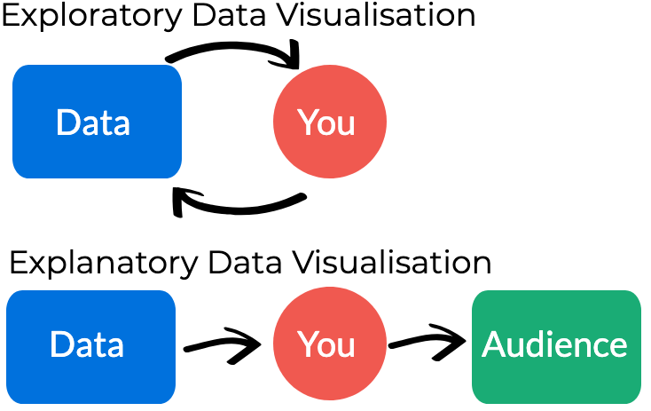
Image inspired by Maarten Lambrechts
How to Explain with Visualisation
Explanatory data visualisation requires a defined audience and clear objective. Before you start to create your visualisation, ask yourself the following:
- What am I trying to say? The message that you are trying to convey should guide the design choices that you make.
- Who am I trying to say it to? Thinking about who your audience is and how they will interact with and use your visualisation will help focus your final product.
Understand the Data
Before you start, get to know your data
Before digging into a COVID-19 dataset, it is important to spend a bit of time understanding what can and cannot be said based on the data. Too often we jump into analysis before taking the time to understand what aspects of the world our data represents.
The first step is to understand the definitions of the data included in your dataset. To do this, you’ll want to review the following:
- the metadata
- the data dictionary
Press down to learn more about metadata and data dictionaries.
Explore the Metadata
Metadata is data about data. Reviewing the metadata before you download a new dataset can save you time and let you know whether the data you are about to download even has what you need. The Humanitarian Data Exchange requires all data shared on the platform to include a few essential metadata fields.
Metadata provides basic information about a dataset such as:
- Source: who is releasing the dataset.
- Date: to include the date the dataset was initially released, the date it was last updated and released, and the expected frequency of update to anticipate the next release date.
- Location: the geographic extent of the dataset and the granularity of the dataset (e.g. for a specific number of countries with data at an admin1 level).
- Methodology: how the data was collected.
Press down to learn more about data dictionaries.
Read the data dictionary
Some organisations will publish data dictionaries along with their data. Oftentimes the headers in a data set are condensed to conserve space and make them machine readable. For example, a field with a header named “cases” could mean cumulative cases, daily cases, or active cases.
A data dictionary provides definitions for variables in a data set to understand what each variable represents. The example below provides an example of definition given for positive and suspected patients as well as the data type (numeric).

Source: Healthcare.gov Data Portal
Common COVID-19 Data Points
The following are a few common figures in COVID-19 datasets:
- New Cases includes the number of confirmed cases (and suspected cases where that is available) for a given timeframe. (Also known as “incidence").
- Cumulative Cases are the total confirmed cases up to a given point in time, without subtracting people who have recovered or died. These numbers over time only get larger and larger as new cases are added.
- Deaths are the number of confirmed deaths (and probable where that is available) for a given timeframe. The case fatality ratio is the number of deaths divided by the number of confirmed cases.
- Active Cases includes the number of confirmed cases (and suspected cases where that is available) for a given timeframe minus those people who have died or recovered from COVID-19. (Also known as "prevalence").
Data Reliability
The accuracy of these numbers is dependent on a number of factors.
- The number of confirmed cases depends on the extent of testing being performed in a country, the accuracy of the tests, and the lag time between when a person is infected, symptomatic and tested.
- The number of deaths depends on if deaths outside of hospitals are counted and if tests are being performed within hospitals prior to or after death.
- The number of active cases is calculated using data on recovered cases. Not all locations are providing proper data on recovered cases and as a result this data may not be reliable.
To ensure that the data you have is as up-to-date and accurate as possible, prioritise data from reputable sources and data with well documented collection methodologies.
Press down to learn more about reliable data sources
COVID-19 Data on HDX
HDX houses a diverse range of datasets on COVID-19 for humanitarians. These include:
- Global case data from the Johns Hopkins School of Public Health and the World Health Organization;
- Testing data from Our World in Data;
- Global school closures from UNESCO; and
- Global travel restrictions and airline information from the World Food Programme.
Choose the Right Visualisation
Relationship Types
Choosing the right visualisation can feel overwhelming. There are a lot of options out there. The best way to narrow it down is to identify the relationship between the variables you want to highlight.
In this section, we will explore the following relationship types and discuss good chart options for each:
- Change Over Time
- Comparison
- Distribution
- Part-to-Whole
- Geospatial
Change Over Time
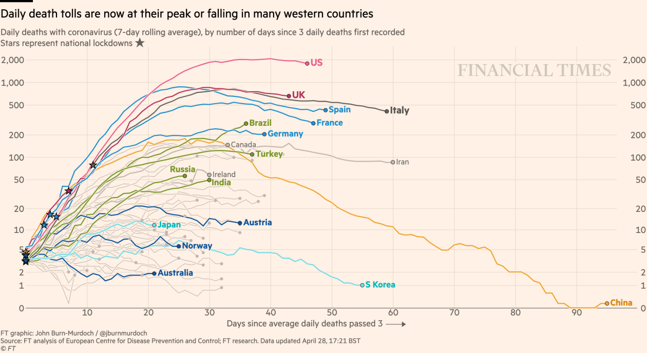
If you have time series data, a common relationship to visualise is change over time. Make sure to plot the timeline on the X axis. The following charts are options to illustrate trends over time.
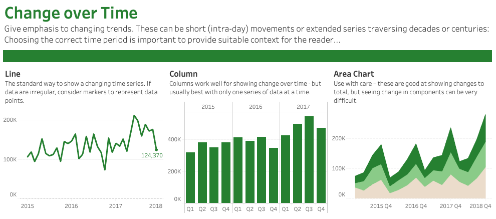
Source: Andy Kriebel & The Financial Times Press down to learn more.
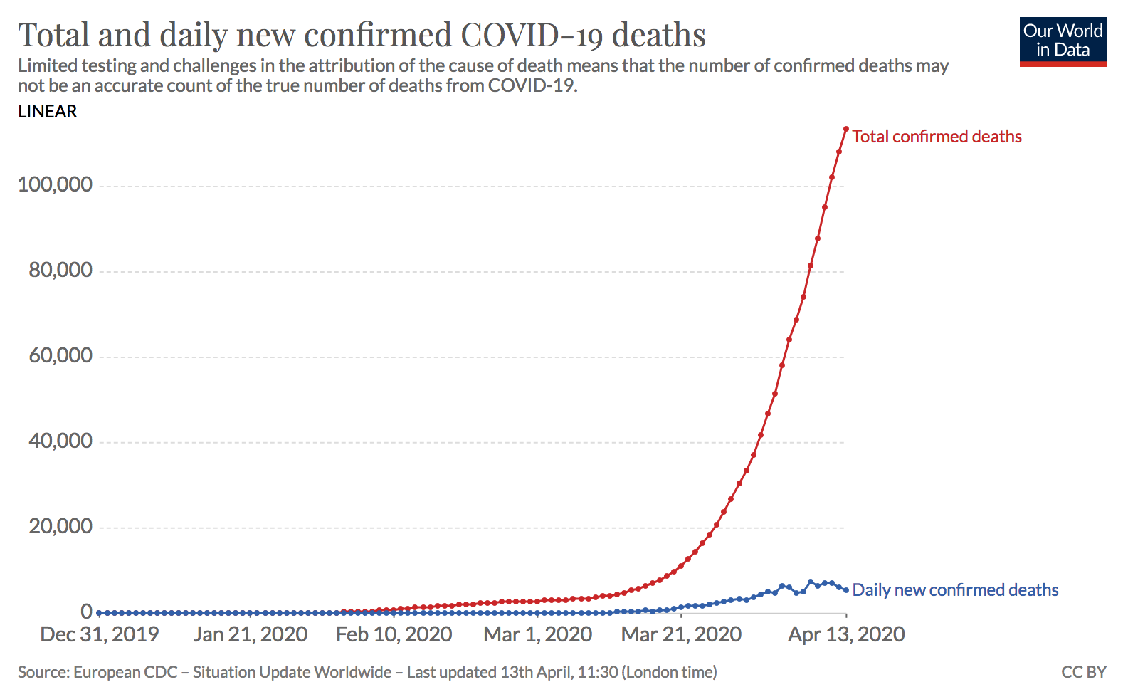
Line Graph
A line graph will emphasise trends by showing a series of points connected by straight lines. Adding visual markers for important events, e.g. when stay at home orders went into effect, is an easy way to add context. Multiple time series should always use line graphs.
Source: Our World in Data Press down for more examples.
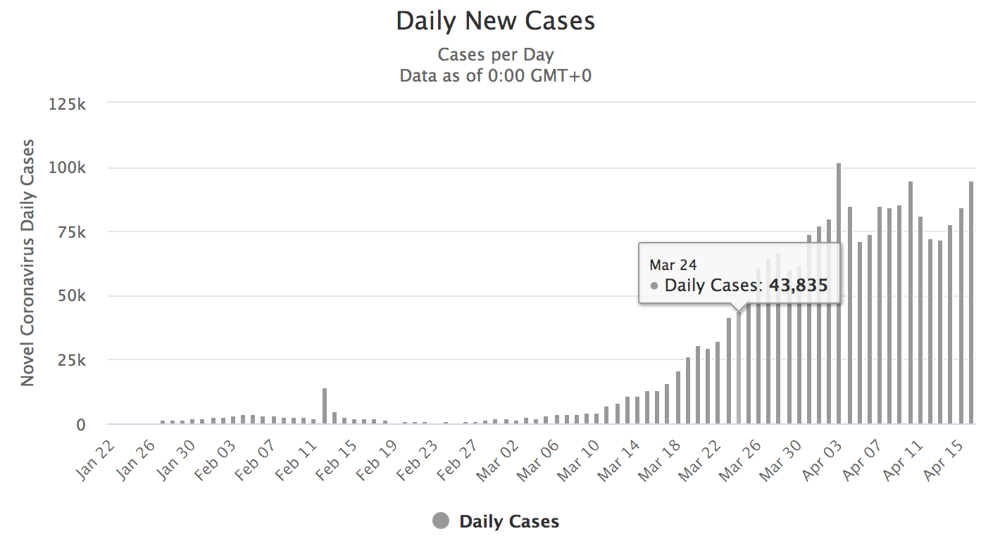
Bar Chart
Time series bar charts are used to emphasise individual values at distinct points in time. They work best when data points are at equal intervals such as days, months or years, e.g. the number of confirmed cases reported daily. Always make sure your Y axis starts at zero.
Source: Worldometer Press down for more examples.
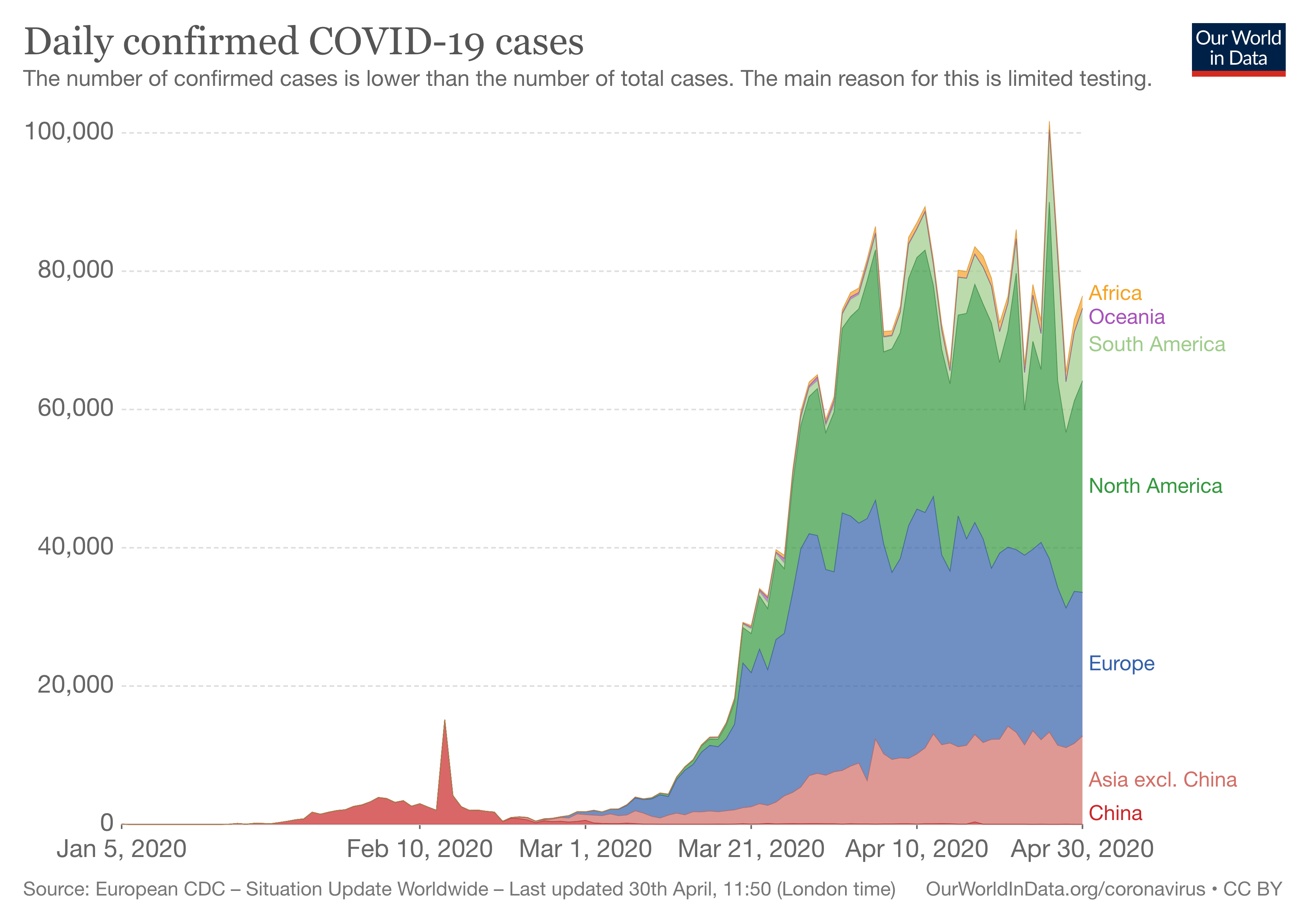
Stacked Area Graph
Stacked area graphs are useful for comparing multiple data series changing over time. The values of each series are displayed on top of each other, which allows you to visualise the change of the total value, e.g. the number of confirmed COVID-19 cases globally, and how the values are evolving in component groups, e.g. region.
Source: Our World in Data
Comparison
Visualisations will often use size, length and position to help viewers explore differences and similarities between categories and data series.

Source: Andy Kriebel & The Financial Times Press down to learn more.
Ordered Bar Chart
Ordered bar and column charts are excellent for showing position and comparing across categories. When your labels are long, horizontal bars should be used. It is always preferable to sort your data as this will make it easier to read.
Press down for more examples.
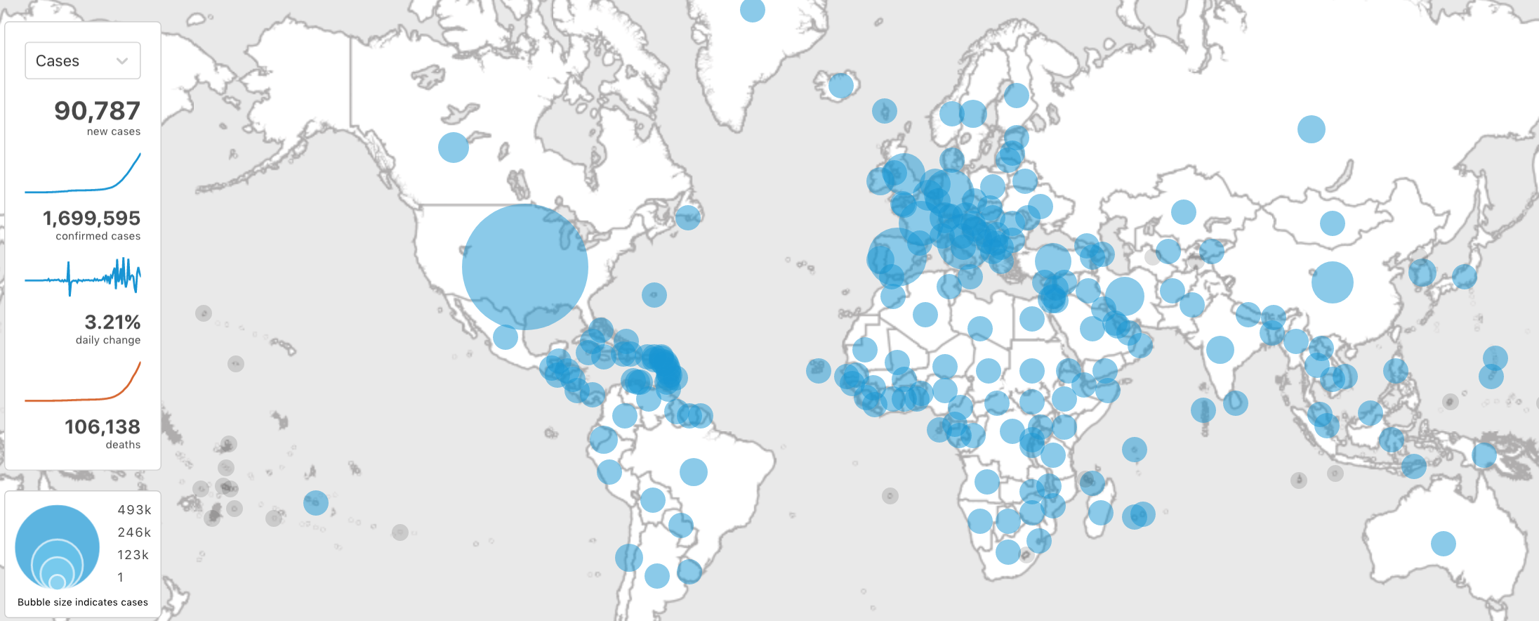
Proportional Symbol Chart
Often called bubble charts, these charts are typically used to compare and show the relationships between categorised circles using both positioning, colours and proportions.
Chart by OCHA Centre for Humanitarian Data
Distribution
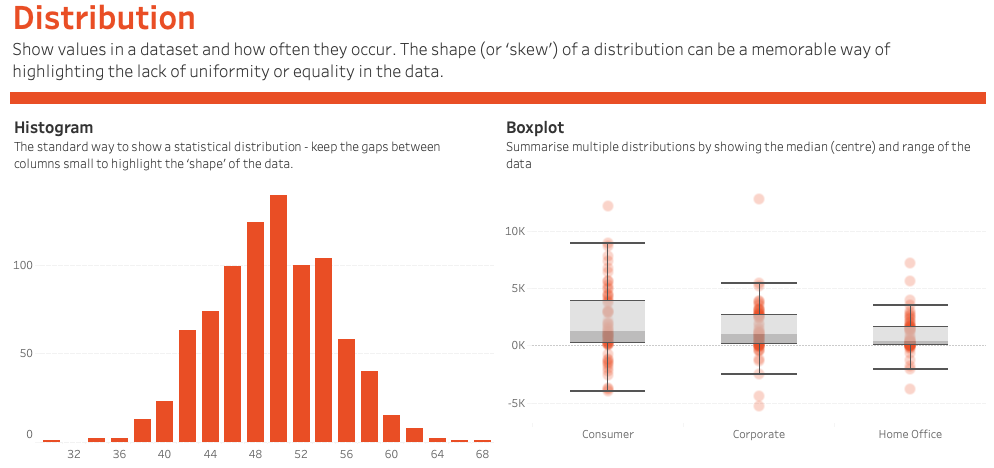
Distribution visualisations are often used to explore data as they show the values in the dataset and how often they occur. The shape (or the skew) of a distribution can be a memorable way of highlighting the lack of uniformity or equality in the data.
Source: Andy Kriebel & The Financial Times Press down to learn more.
Histogram
Histograms are useful for understanding the spread of the data. They show where values are concentrated, what the extremes are and whether there are any gaps. They may look similar to a vertical bar chart but are different in an important way. The horizontal (X) axis is numerical, not categorical.
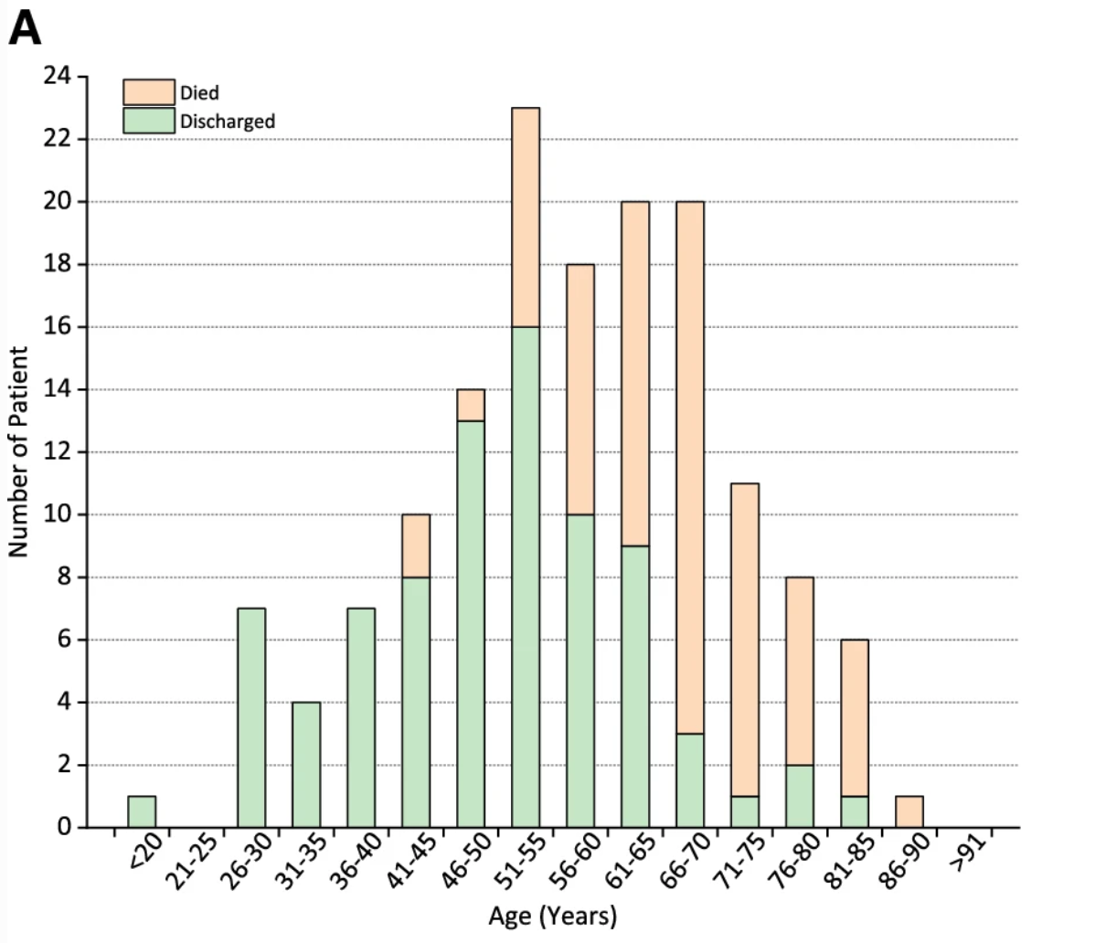
Source: Springer Press down for more examples.
Box Plot
Box Plots (also referred to as box and whisker plots) are popular among statisticians and researchers. They are helpful for summarising multiple distributions by showing the median (centre) and range of the data. While useful for exploring data, not everyone understands how to interpret box plots. Use sparingly as an explanatory tool.
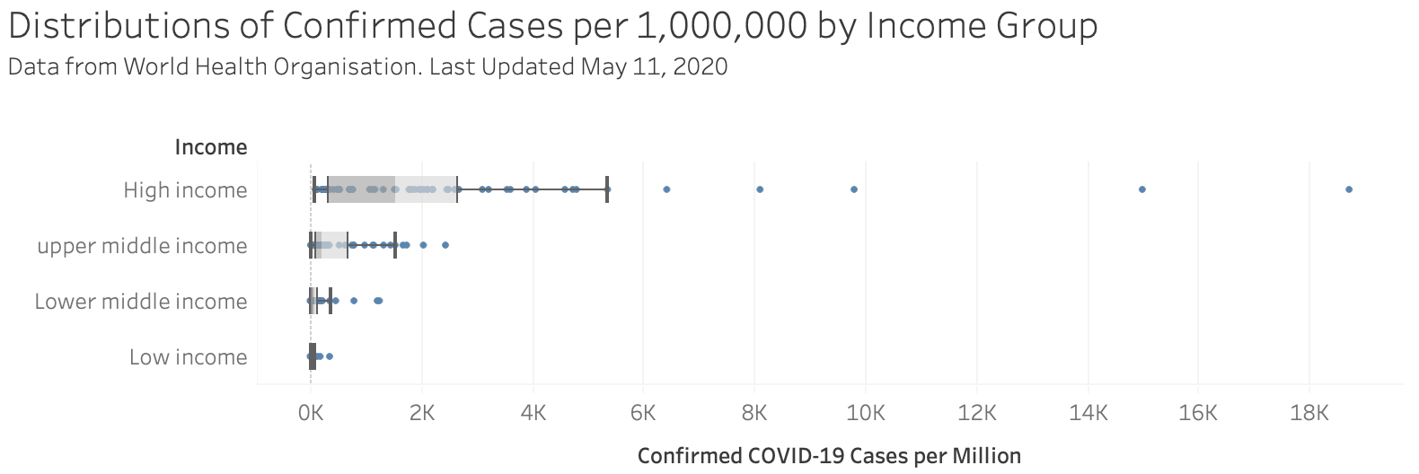
Source: OCHA Centre for Humanitarian Data
Part-To-Whole
These charts are useful for showing how various parts of the data comprise the whole. While useful with a small number of categories they can quickly become difficult to read. If you are mainly interested in comparing the size of the parts, often a simple bar chart will be easier to read.
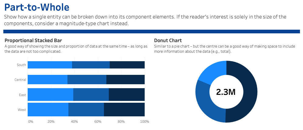
Source: Andy Kriebel & The Financial Times Press down to learn more.
Donut Chart
Over time, the donut chart has become increasingly popular. The donut chart is similar to a pie chart but the centre can be a good way of making space to include more information about the data (e.g. total).
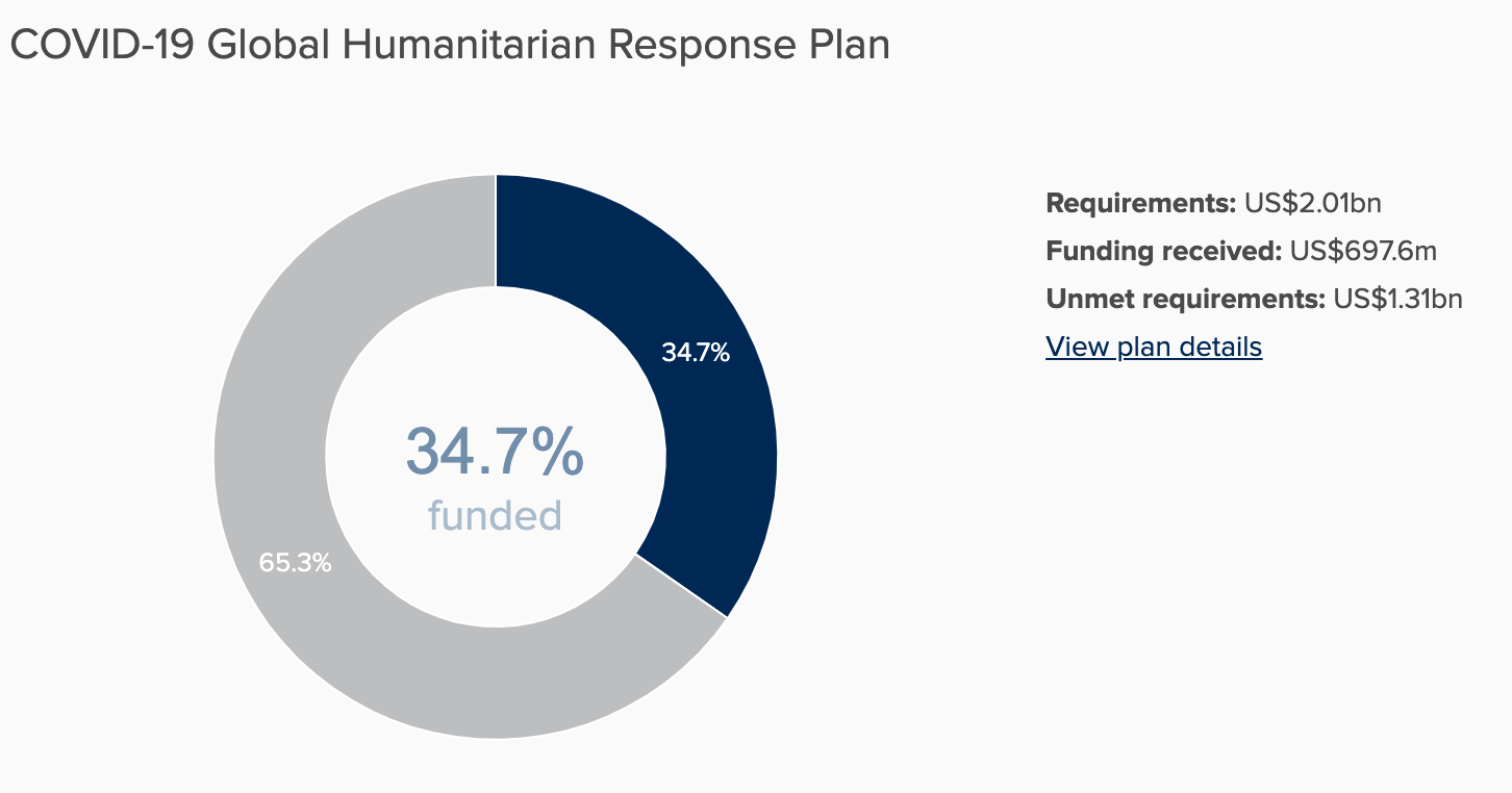
Source: OCHA Financial Tracking Services Press down for more examples.
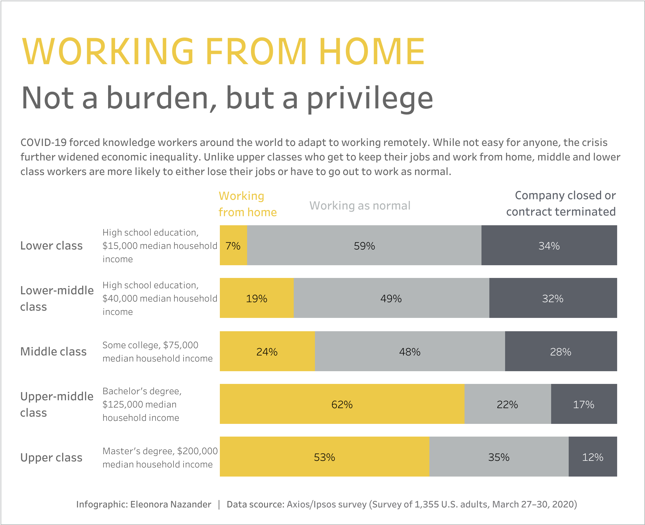
Proportional Stacked Bar
The proportional stacked bar is another simple way of showing a part-to-whole relationship. This chart is especially good when comparing variables across groups or at different points in time.
Source: Eleonora Nazander
Geospatial
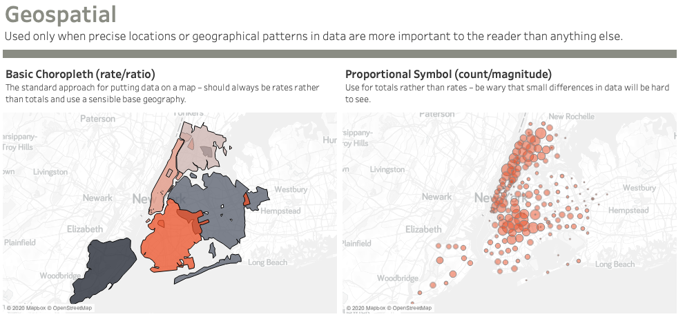
Only use maps when precise locations or geographical patterns in data are a crucial part of your message. When the interesting patterns in your data are not geographic patterns, a map may end up distracting from your message. Just because it can be mapped, does not mean it must be mapped.
Source: Andy Kriebel & The Financial Times Press down to learn more.
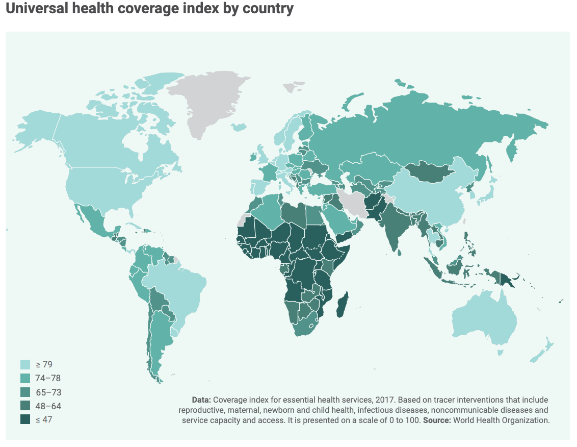
CHOROPLETH
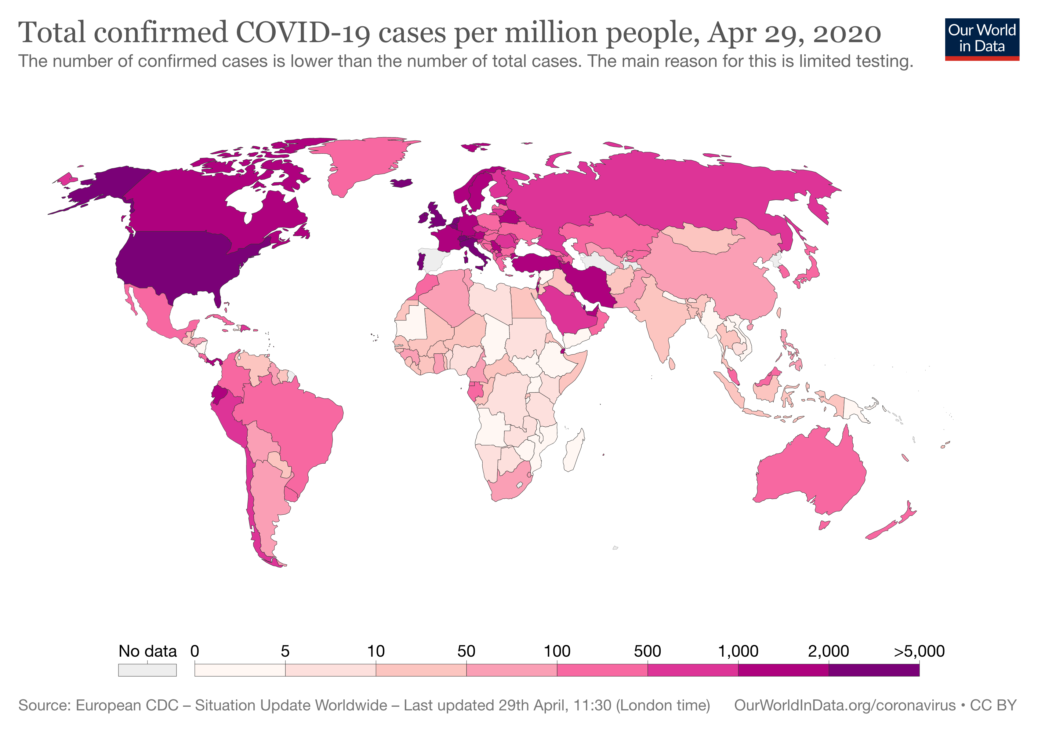
This standard approach for putting data on a map, displays geographical areas that are coloured, shaded or patterned in relation to a data variable. It is often better to use rates rather than totals for this type of map.
Source: United Nations Global Humanitarian Response Plan for COVID-19 Press down for more examples.
Proportional Symbol Map
This map scales the size of symbols proportionally to the data value found at that location. The larger the symbol, generally the higher the value of something at a location.
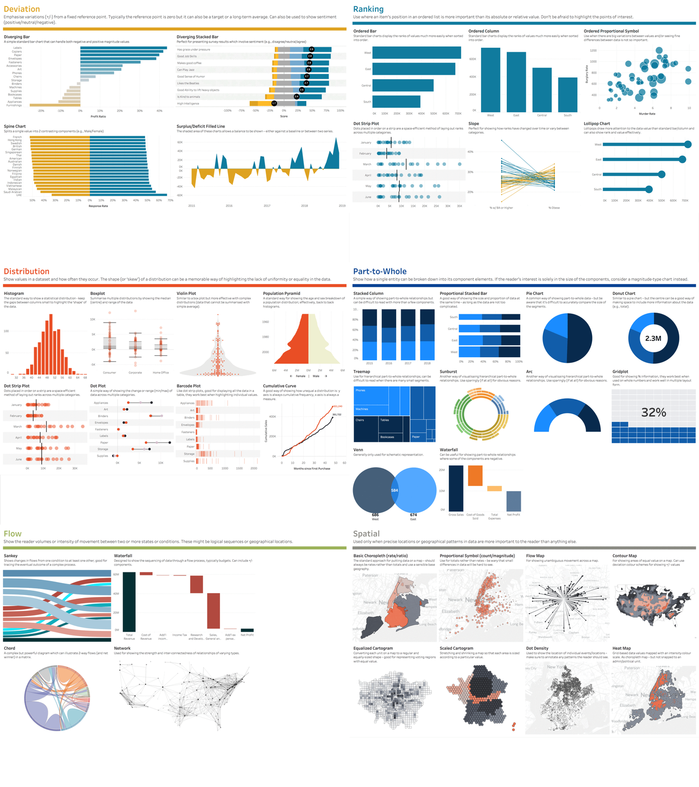
Chart Choosers
There are many tools out there to help you make the most appropriate graph for your data.
- The Financial Times' Visual Vocabulary
- Data Visualisation Catalogue
- From Data to Viz's Chart Explorer
Designing Thoughtfully
Design Considerations for THOUGHTFUL VISUALISATIONS
The way we communicate about the COVID-19 pandemic has the potential to shape our audience's perception of risk and safety.
The design choices we make influence how our audience interprets our underlying data. This is because through our design we choose to emphasise certain aspects of the data while potentially obscuring others. While there are no hard and fast rules for making design choices, the following are a few considerations to think about when creating COVID-19 data visualisations.
Consider the Connotation of Colours
Red is a colour that grabs a reader’s attention and is often used to alert and highlight. A map full of overlapping red circles may communicate alarm and, as a result, may distract from other messages. Consider the connotation of colours when creating COVID-19 visualisations.
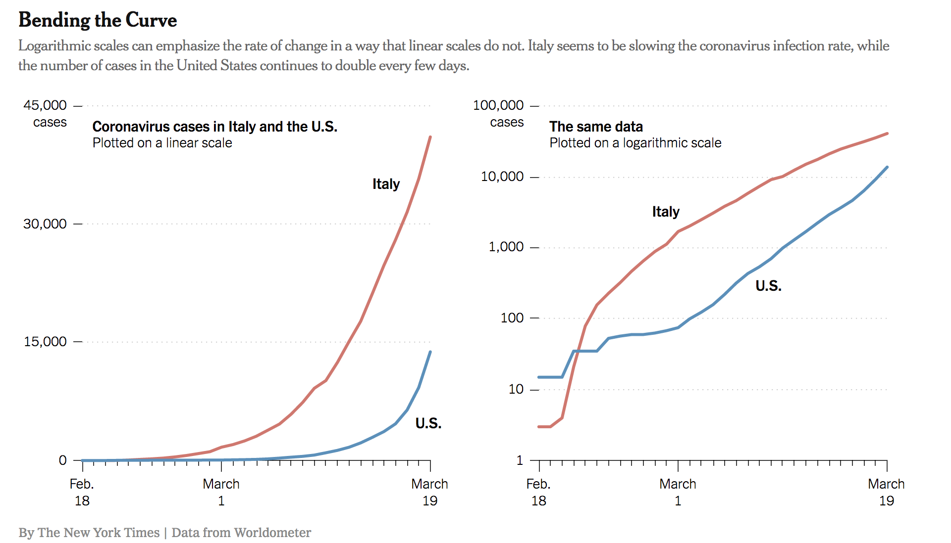
Consider Using a Logarithmic Scale
Plotting exponential growth on a linear scale can obscure important details such as the rate of growth. In the example below, the U.S. and Italy look like they are on similar trajectories on the linear scale whereas it is more apparent on the logarithmic scale that COVID-19 cases are continuing to grow in the U.S. while Italy is seeing a slowdown.
Source: Kenneth Chang Press down to learn more.
Linear and Logarithmic Scales
The most common form of a line graph uses a linear scale. Along the Y axis, the numbers progress in a linear form: 1, 2, 3, or 10, 20, 30, etc.
On a logarithmic scale, numbers on the Y axis don’t increase in equal increments. Each interval increases by a set factor – often 10 but could be a factor of 3 or 350 or 3,500, etc.
A logarithmic scale prevents large numbers from skewing a whole graph and is good for measuring rates of change, particularly rates of growth (e.g. number of cases, deaths, etc. over time). In the case of COVID-19, that is growing exponentially, it will often make sense to use a logarithmic scale because the cumulative case trend line can “keep up” with the numbers instead of shooting off the chart. Read more about logarithmic scales at The Conversation.
Know the Difference between Relative and Absolute Values
With the message you want to convey in mind, explore different ways to represent the data you are visualising. When comparing across countries or regions, consider how your visualisation will change based on your choice to use absolute numbers (total number of confirmed cases) versus relative numbers (number of confirmed cases per X thousand people).
In their purest sense, an absolute value is a value compared to nothing, and a relative value is created when two absolute values are compared to each other. Relative values are often presented as percentages, proportions, rates, etc., and are good for providing a reference for readers to judge magnitude and to compare magnitude across different categories.
The choice to use one or the other depends on the message you are trying to convey.
Press down for examples.
Using Relative COVID-19 Numbers
The choropleth map is an example of a visualisation that works best with relative numbers because they provide a common reference to compare magnitude across countries or regions.
Source: Our World in Data Press down to learn more.
Using Absolute COVID-19 Numbers
COVID-19 logarithmic line graphs often use absolute numbers, why? The emphasis when using a logarithmic scale is the exponential change over time, or trajectory, rather than the magnitude.
Communicate Uncertainty
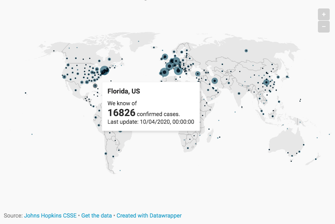
There is a great deal of uncertainty around COVID-19, and this is present in the data. Try to find ways to convey that uncertainty in your visualisation. For example, adding the simple phrase ‘we know of X cases’ helps convey the critical message that the data we have is incomplete.
Source: Lisa Charlotte Rost Press down to learn more
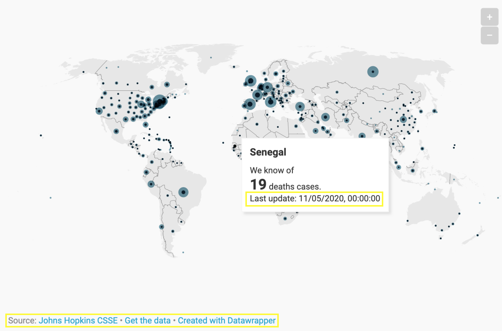
Communicate the Date & Source Clearly
With the velocity of changes in the COVID pandemic, providing readers information on the date that data pertains to and the frequency of updates helps them understand how current a visualisation is.
Source: Lisa Charlotte Rost
Get to the Point
Sometimes charts get in the way of the message you are trying to convey. Consider if it is best to present a simple visual number(s) that you want to emphasise, to get to the point.

Source: Vox.com
Create your own Visualisation
Do it yourself
It’s time to create your own visualisation. You have learned why we create visualisations, some considerations to make when visualising COVID-19 data and how to use various charts to highlight and communicate different relationships.
In this final section, we'll walk through how to create a logarithmic line graph. Included in this is a downloadable step-by-step guide.
Create A Line Graph in Excel
Download our Step-By-Step Guide to Creating a Line Graph.
- Download the data from HDX;
- Prepare & structure your data;
- Insert a line graph;
- Explore using a logarithmic scale; and
- Customise the design.
Press down to walk through the steps together.
Download data: Click on the video below to learn how to find and download data from HDX.
Press down for the next step.
Prepare & structure your data: Click on the video below to learn how to organise, filter and structure your data in order to create a line graph visualising the growth in COVID-19 cases.
Press down for the next step.
Insert a line graph: Next, watch the video below to learn how to insert a line graph as well as how to format the date axis in your chart.
Press down for the next step.
Explore using a logarithmic scale: Watch the video below to learn how to format your Y axis using a logarithmic scale.
Press down for the next step.
Customise the design: Now it’s time to customise the visualisation! Watch the video below to learn how to add text, change fonts and reduce clutter in your graph.
Additional Resources
- The OCHA Centre for Humanitarian Data's Data Literacy Page.
- The resources in this lesson (videos, slides and step-by-step guide) are available for download and offline use in this Google Drive folder.
- Tableau's 10 considerations before you create another chart about COVID-19.
- Data Wrapper's 17 (or so) responsible live visualizations about the coronavirus, for you to use.
- Vox.com's video on how coronavirus charts can mislead us.
Glossary of Terms
- Incidence: The number of new cases of a health event (such as development of a disease, or reaction to a medicine) that occur during a specific time period, usually a year, in a specified population. Incidence is therefore also a measure of the risk of experiencing the health event during a certain period of time. European Patients' Academy
- Prevalence: Prevalence is the proportion of a population found to have a condition (typically a disease or a risk factor such as smoking). Prevalence can be measured at a particular point in time (point prevalence), or over a specified period such as a year (period prevalence). European Patients' Academy
- Time Series: A series of data points ordered in time. Towards Data Science
- Data Dictionary: A data dictionary is used to catalogue and communicate the structure and content of data, and provides meaningful descriptions for individually named data objects. Data Strategy for the Secretary-General for Action by Everyone, Everywhere & U.S. Geological Survey
- Metadata: Metadata is additional information or documentation about your dataset that will make it easier for others to understand and put your data into context. OCHA Centre for Humanitarian Data
