Multiple choice question in which respondent can select more than one correct answer from the list is a usual part of almost every survey.
It is usually visualized as a simple bar chart ignoring the overlap between the different categories, while this overlap can bring more analytical value and depth to the analysis.
Euler diagram is a perfect way to show the relationship between different subsets and that’s hardly possible to build it with the commonly used spreadsheet software such as MS Excel.
In R this is quite easy with eulerr package, below is the demonstration that includes data extraction from Kobo with koboloadeR package.
Get the data with koboloadeR
# download the data with your credentials
# df <- kobo_data_downloader("datasetID", "login:password")

#check the column names with colnames(df)

# you need to identify the columns associated with one multi choice question
# each option of a multi choice question would be represented as 1 column,
# all these columns would have identical prefix, such as "B/whyreturn/" in the example below.
# these columns would contain either True or False or n/a value

 # [44] "B/whyreturn/stabilized"
 # [45] "B/whyreturn/nojob"
 # [46] "B/whyreturn/highrent"
 # [47] "B/whyreturn/badrelation"
 # [48] "B/whyreturn/takecare"
 # [49] "B/whyreturn/wanthome"
 # [50] "B/whyreturn/fear"
 # [51] "B/whyreturn/other"
Make euler chart with identified dataset
A note of caution: there are many ways this process might look like and depending on your flow it can be changed. In this example we just concentrate on this narrow task of building a simple Euler chart.
#select only the identified columns in format "firstOne:lastOne"
# dfSubset <- select(df, "B/whyreturn/stabilized":"B/whyreturn/other") %>%
#   #change column type to boolean
#   mutate_each(list(as.logical)) %>%
#   #unfilter those with N/As (question not asked in case of conditional flow)
#   filter_all(any_vars(!is.na(.))) %>%
#   #removing the prefixes
#   rename_all(list(~str_replace(., "B/whyreturn/", "")))
#   #after this one may also rename some columns
#
# #make a chart
# plot(euler(df1Subset, shape = "ellipse"), quantities = TRUE, labels = TRUE, legend = TRUE, main = "here be the title")
If there are more than 6 columns
you may want to limit the number of columns as * plot might be very busy and not readable * it is computationally heavy and may require significant resources to render the plot under the hood there is a lot of math: https://cran.r-project.org/web/packages/eulerr/vignettes/under-the-hood.html
#this describes the process from beginning but with additional limitation on the number of columns

# #select only the identified columns in format "firstOne:lastOne"
# dfSubset <- select(df, "B/whyreturn/stabilized":"B/whyreturn/other") %>%
#   #change column type to boolean
#   mutate_each(list(as.logical)) %>%
#   #unfilter those with N/As (question not asked in case of conditional flow)
#   filter_all(any_vars(!is.na(.))) %>%
#   #removing the prefixes
#   rename_all(list(~str_replace(., "B/whyreturn/", "")))
#   #after this one may also rename some columns
#
# # number of columns (variables), you may play with different number
# HowMany <- 6L
#
# #make a vector of topN variables
# dfSubsetTop <- gather(dfSubset, everything(), key = "selected", value = "val") %>%
#   group_by(selected) %>%
#   summarise(sum = sum(val)) %>%
#   top_n(HowMany, sum) %>%
#   select(selected) %>%
#   as_vector()
#
# #overwrite the initial subset with topN variables
# df1Subset <- select(df1Subset, one_of(df1SubsetTop))
#
# #let's also see how much time it would take
# start.time <- Sys.time()
#
# #make a chart
# plot(euler(df1Subset, shape = "ellipse"), quantities = TRUE, labels = TRUE, legend = TRUE, main = "here be the title")
#
# end.time <- Sys.time()
# time.taken <- end.time - start.time
# time.taken
An example with a dummy variables
you may want to read more here: https://cran.r-project.org/web/packages/eulerr/vignettes/venn-diagrams.html
#generate a matrix of 20 columns with logic values

randomBool <- sample(c(TRUE,FALSE),size = 10000, replace = TRUE, prob = c(0.25, 0.75))
dfRandom <- data.frame(matrix(data = randomBool, ncol = 20, nrow = 500))

# let's limit the number of columns (variables)
HowMany <- 5L

#make a vector of topN variables
dfRandomTop <- gather(dfRandom, everything(), key = "selected", value = "val") %>%
  group_by(selected) %>%
  summarise(sum = sum(val)) %>%
  top_n(HowMany, sum) %>%
  select(selected) %>%
  as_vector()

#overwrite the initial subset with topN variables
dfRandom <- select(dfRandom, one_of(dfRandomTop))

#let's also see how much time it would take
start.time <- Sys.time()

#make a chart
plot(euler(dfRandom, shape = "ellipse"), quantities = TRUE, labels = TRUE, legend = TRUE, main = "here be title")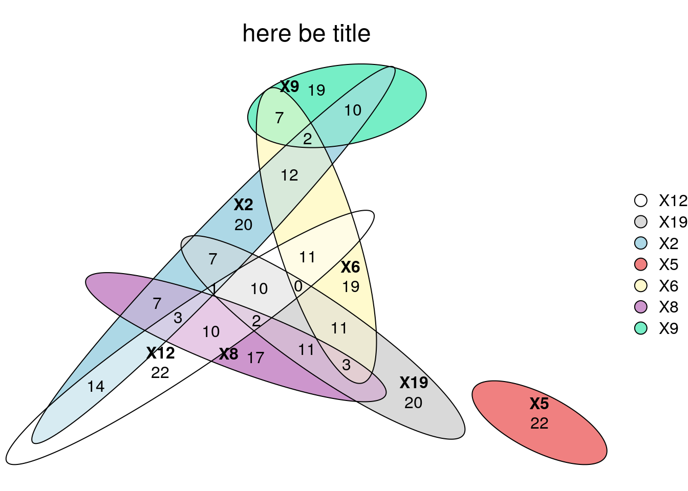
end.time <- Sys.time()

time.taken <- end.time - start.time
time.taken
## Time difference of 3.909639 secs
Share this post
Twitter
Google+
Facebook
Reddit
LinkedIn
StumbleUpon
Pinterest
Email