The OCHA’s Centre for Humanitarian Data has recently produce some Quick Tips for Visualising Data using examples from the COVID-19 Pandemic. It includes a tutorial explaining how to generate a Logarithmic Line Chart with Excel. This tutorial will demonstrate how to increase your productivity by doing the same with R.
R often appears a bit complicated for beginners as it is based on command rather than point on click on a graphical interface. With some practice, what might appear as a challenge is actually an advantage as you can very quickly reproduce a results or review what someonelse has done. Over time, copy-pasting command is lot more effective than clicking and is the key to professional level productivity.
Using the World Health Organization (WHO) data from the Humanitarian Data Exchange (HDX) here coronavirus-covid-19-cases-and-deaths, we will create a logarithmic chart for the cumulative COVID-19 cases for Afghanistan.
We will:
Download the data from the live data source (here google spreadsheet);
Prepare & structure the data;
Insert a line graph;
Explore using a logarithmic scale; and
Customize the design.
The tutorial below assumes that you have installed R and Rstudio, both being open source software, working on any operating system and coming at no cost for you and your organisation. A good starting point can be to go through this guide: Help, My Collaborator Uses R! An Introduction to ReproducibleStatistical Analyses in R.
Once installed just create a new project and copy paste the code presented below in your interface. Alternatively you can download this tutorial notebook here and run code chunk one by one.
Get the packages
R works with packages. They are the equivalent of macro functions in Excel. They can be easly installed with one command line. Getting easiy access to the packages and being able to create and distribute them is one of the big advantage of R.
## Getting all necessary package
using <- function(...) {
    libs <- unlist(list(...))
    req <- unlist(lapply(libs,require,character.only = TRUE))
    need <- libs[req == FALSE]
    if (length(need) > 0) {
        install.packages(need, repos = 'https://mirrors.tuna.tsinghua.edu.cn/CRAN/')
        lapply(need,require,character.only = TRUE)
    }
}

## Getting all necessary package
using("ggplot2", "ggthemes")
## Loading required package: ggplot2## Loading required package: ggthemesFirst Get the data
No need to download and save the data. R can retrieve data directly from the HDX server! Just insert the URL to get thhe data with the base read.csv function.
You are have the basis of R: i.e it’s all about mapinuplating different type of object. An object is simply created by giving it name, here mydata and use the assing sttement <-
mydata <- read.csv("https://docs.google.com/spreadsheets/d/e/2PACX-1vSe-8lf6l_ShJHvd126J-jGti992SUbNLu-kmJfx1IRkvma_r4DHi0bwEW89opArs8ZkSY5G2-Bc1yT/pub?gid=0&single=true&output=csv")The command names will tell us the names of the variable
names(mydata)## [1] "OBJECTID" "ISO_2_CODE" "ISO_3_CODE" "ADM0_NAME"
## [5] "date_epicrv" "NewCase" "CumCase" "NewDeath"
## [9] "CumDeath" "Short_Name_ZH" "Short_Name_FR" "Short_Name_ES"
## [13] "Short_Name_RU" "Short_Name_AR"Structure Data
You first need to structure your data With Category representing the Horizontal (X) Axis and Series representing that values for different variables being represented.
- First filter the data set to show only Afghanistan data
mydata <- mydata[ mydata$ISO_3_CODE == "AFG", ]- Date Field: We want to have a readable date field. The format specified here (e.g. 2020-02-24T00:00:00.000Z) can be recognied quickly by R.
The format here is Y-m-dThhmmss.sss
Below is the required command. We can save the recognised variable as anew variable within the same data frame by just changing the variable name. Here date_epicrv2 is created
mydata$date_epicrv2 <- as.Date(parsedate::format_iso_8601(mydata$date_epicrv))
str(mydata)
## 'data.frame': 161 obs. of 15 variables:
## $ OBJECTID : int 1 2 3 4 5 6 7 8 9 10 ...
## $ ISO_2_CODE : chr "AF" "AF" "AF" "AF" ...
## $ ISO_3_CODE : chr "AFG" "AFG" "AFG" "AFG" ...
## $ ADM0_NAME : chr "Afghanistan" "Afghanistan" "Afghanistan" "Afghanistan" ...
## $ date_epicrv : chr "2020-02-24T00:00:00.000Z" "2020-02-25T00:00:00.000Z" "2020-02-26T00:00:00.000Z" "2020-02-27T00:00:00.000Z" ...
## $ NewCase : int 5 0 0 0 0 0 0 0 0 0 ...
## $ CumCase : int 5 5 5 5 5 5 5 5 5 5 ...
## $ NewDeath : int 0 0 0 0 0 0 0 0 0 0 ...
## $ CumDeath : int 0 0 0 0 0 0 0 0 0 0 ...
## $ Short_Name_ZH: chr "阿富汗" "阿富汗" "阿富汗" "阿富汗" ...
## $ Short_Name_FR: chr "Afghanistan" "Afghanistan" "Afghanistan" "Afghanistan" ...
## $ Short_Name_ES: chr "Afganistán" "Afganistán" "Afganistán" "Afganistán" ...
## $ Short_Name_RU: chr "Афганистан" "Афганистан" "Афганистан" "Афганистан" ...
## $ Short_Name_AR: chr "أفغانستان" "أفغانستان" "أفغانستان" "أفغانستان" ...
## $ date_epicrv2 : Date, format: "2020-02-24" "2020-02-25" ...Create a first line Chart
library("ggplot2")
##creating a new object called 'myveryfirstplot' where I will store my chart
myveryfirstplot <- ggplot(mydata,
                   aes(x = date_epicrv2,
                       y = CumCase,
                       group = 1 ))  +
                   geom_line()

## displaying it on my screen
myveryfirstplot 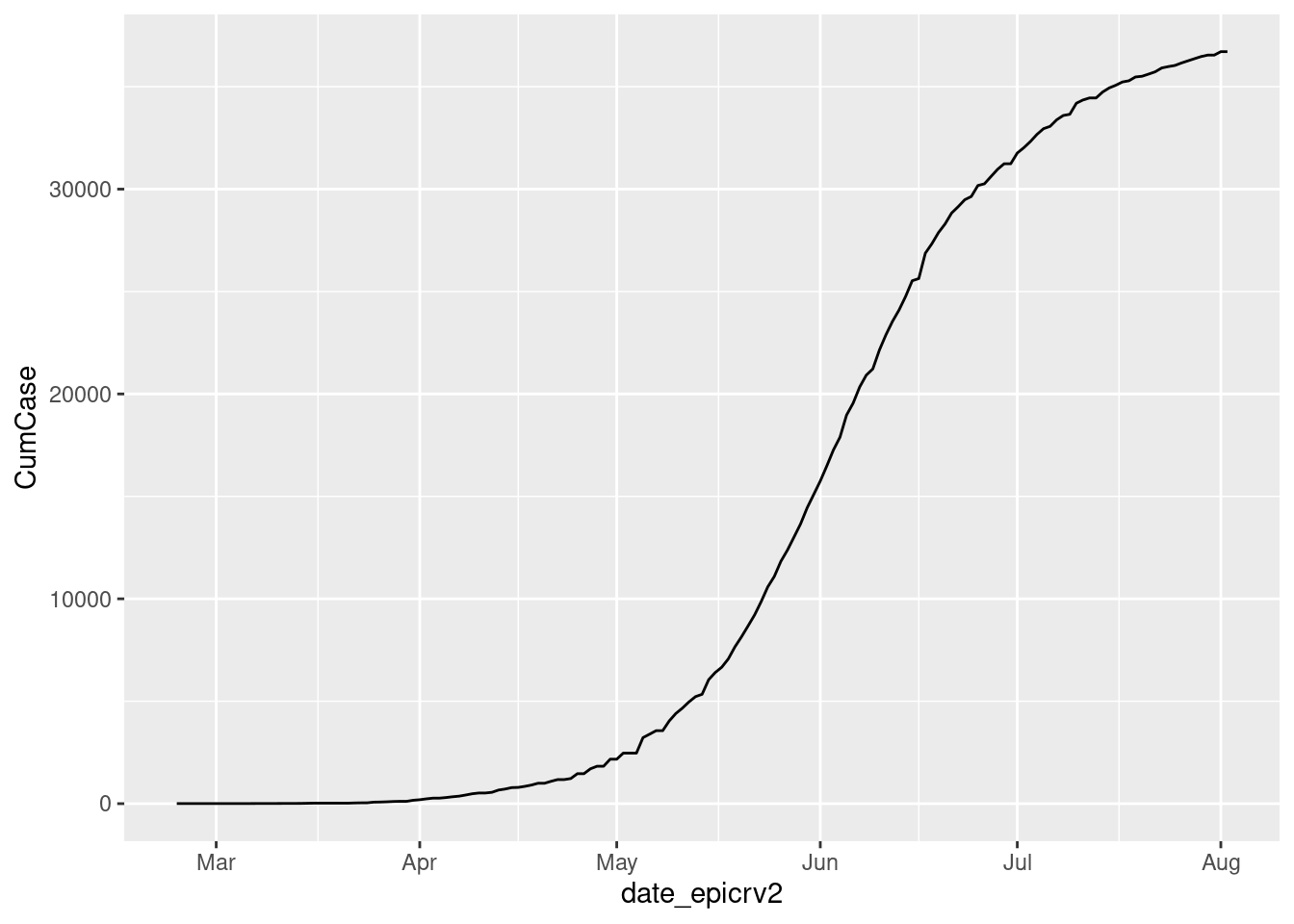
With 4 lines of command, you should have already done your first chart. It is not yet beautifull in a couple of lines we will make it better
Configures label
- Title: Change the title to “Cumulative COVID-19 CasesAfghanistan (as of 20 April)”.
myveryfirstplot  <- myveryfirstplot   +
                   ggtitle( "Cumulative COVID-19 Cases Afghanistan (as of 20 April)")
myveryfirstplot 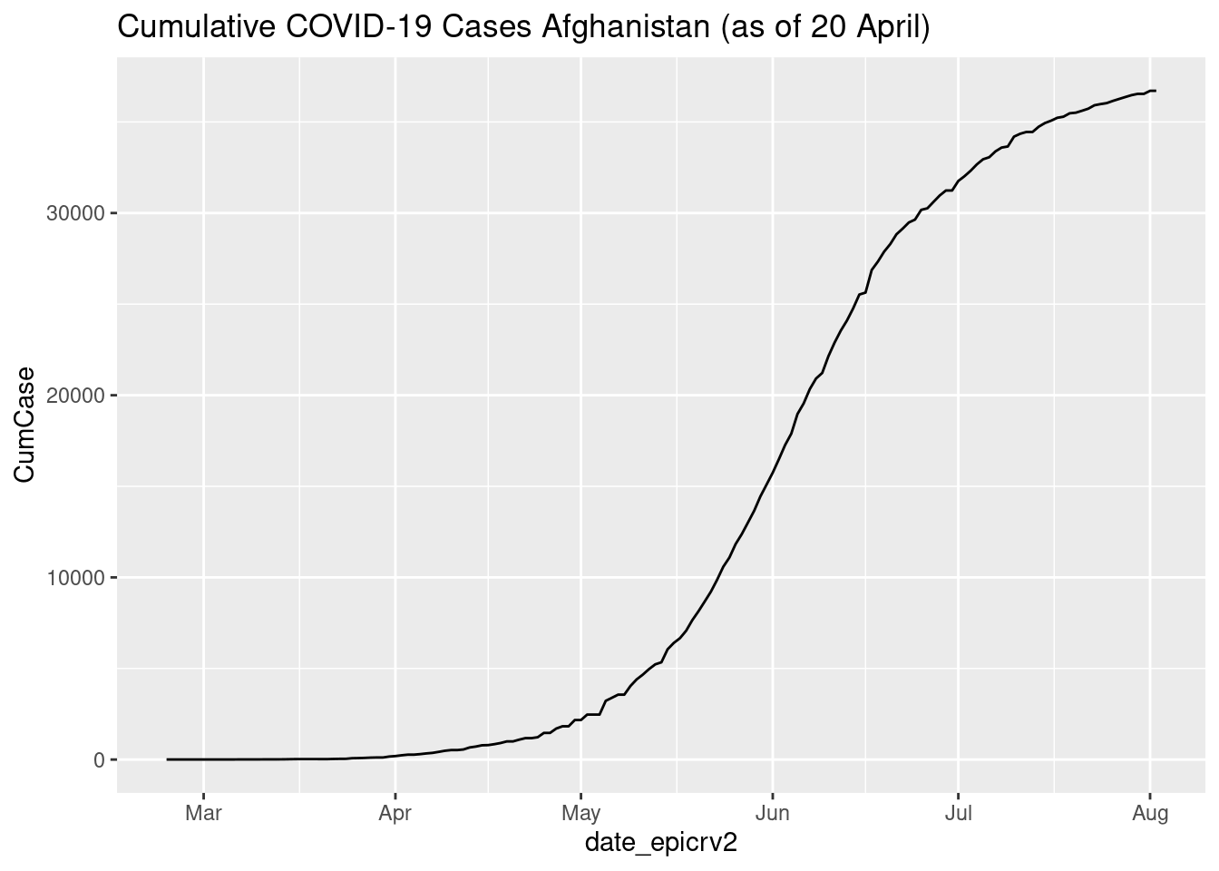
Let’s split between title and subtitle
myveryfirstplot  <- myveryfirstplot   +
                   ggtitle( "Cumulative COVID-19 Cases in Afghanistan",
                   sub = "As of 20 April")
myveryfirstplot 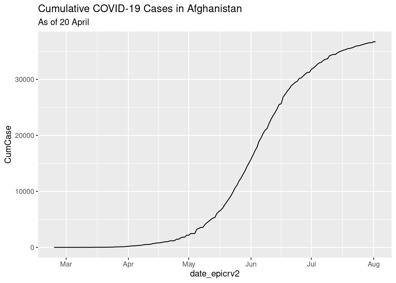
Label for x & y are not useful, let’s remove them
myveryfirstplot  <- myveryfirstplot   +
                    labs(x = "", y = "")
myveryfirstplot 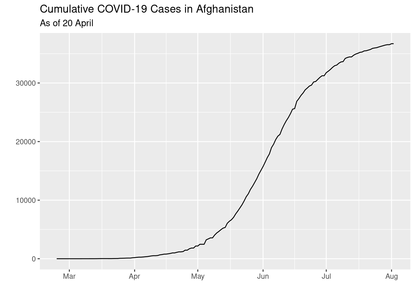
Add a Source: “Source: WHO”
myveryfirstplot  <- myveryfirstplot   +
                   labs(caption = "Source: WHO")
myveryfirstplot 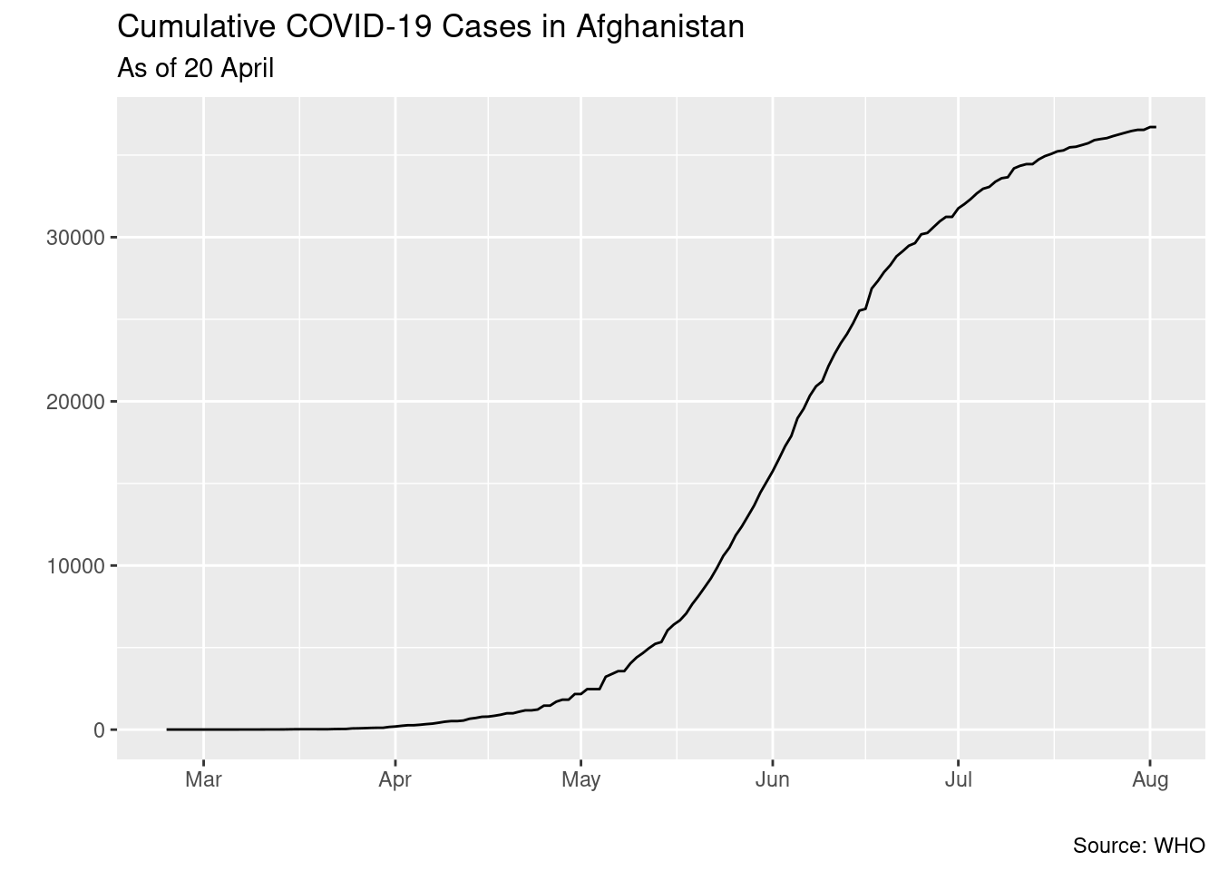
Gridline: Remove the grid line in the chart and a white clean background
myveryfirstplot  <- myveryfirstplot   +
                    theme_bw() +
                    theme(
                          axis.line.y = element_blank(),
                          axis.line = element_line(color = "gray", size = 1, linetype = "solid"),
                          panel.background = ggplot2::element_blank(),
                          panel.border = element_blank(),
                          panel.grid.major.y = element_line(color = "#cbcbcb"),
                          panel.grid.major.x = element_blank(),
                          panel.grid.minor.x = element_blank(),
                          panel.grid.minor.y = element_blank()) ### changing grid line that should appear

myveryfirstplot 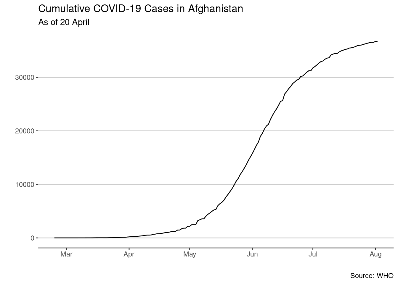
Change the font to “Avenir” or another font of your choice and make the font size of the date smaller than the title. We chose 14 points for the main title and 12 points for the date.
myveryfirstplot  <- myveryfirstplot   +
                    ggplot2::theme( plot.title = ggplot2::element_text(family = "Avenir",
                                                                       size = 14,
                                                                       face = "bold",
                                                                       color = "#222222"),
                                    plot.subtitle  = ggplot2::element_text(family = "Avenir",
                                                                       size = 12,
                                                                       color = "#222222"))
myveryfirstplot 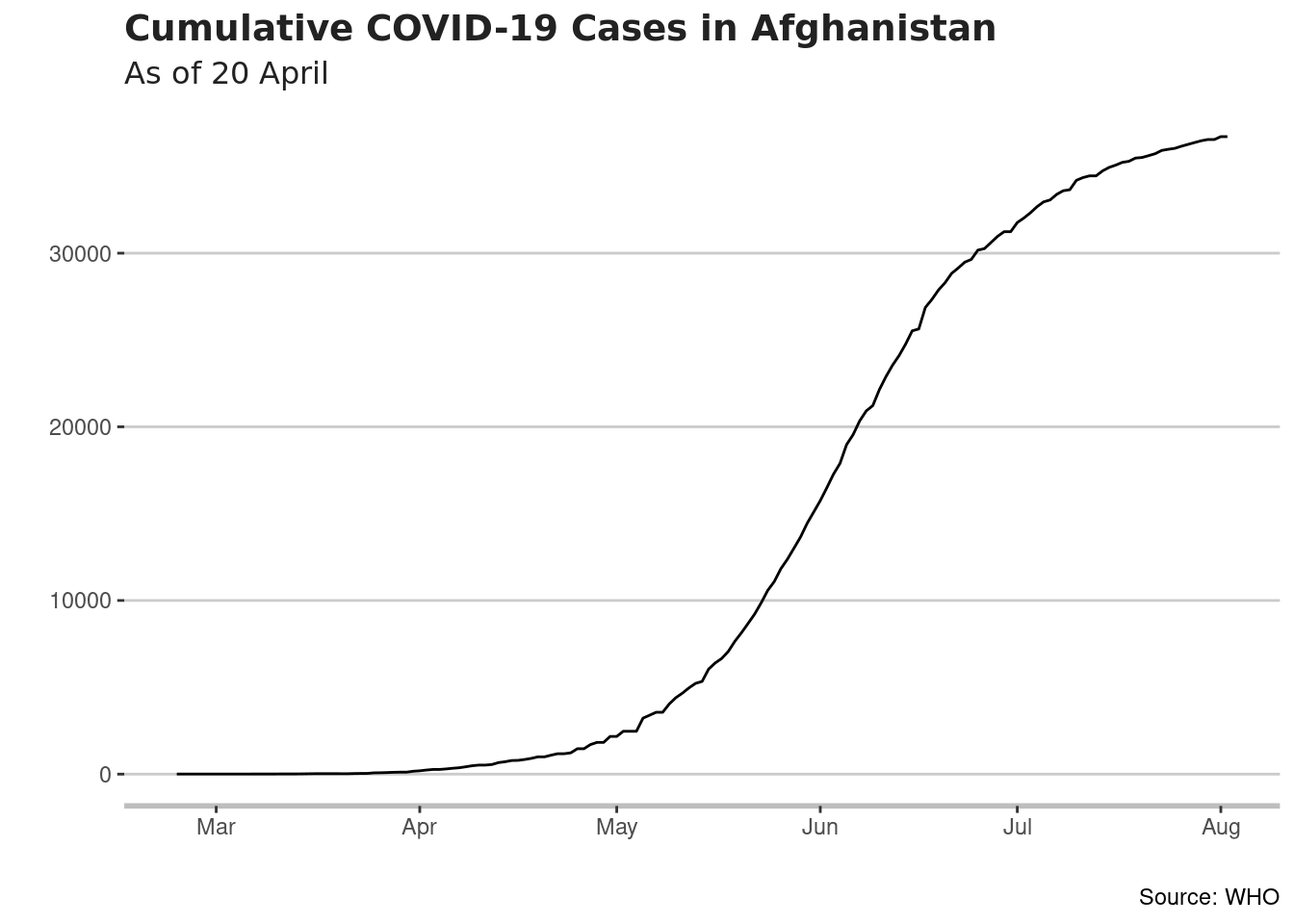
Change color data series line: We have selected Orange Accent 2.
myveryfirstplot  <- myveryfirstplot   +
                   geom_line(color = "orange", size = 1)

## displaying it on my screen
myveryfirstplot 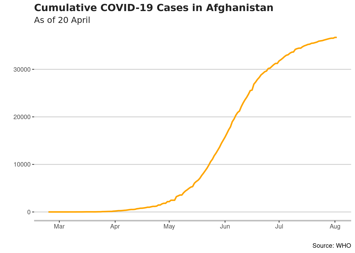
Format X axis
We nned only up to 20 April We want to see the month spelled out with only the number for the day and no year displayed. We want to show every 14 days.
myveryfirstplot  <- myveryfirstplot   +
                    scale_x_date(limits=c(as.Date("2020-02-24"), as.Date("2020-04-20")),
                                 labels = scales::label_date(format("%d-%b") ))

myveryfirstplot
## Warning: Removed 104 row(s) containing missing values (geom_path).
## Warning: Removed 104 row(s) containing missing values (geom_path).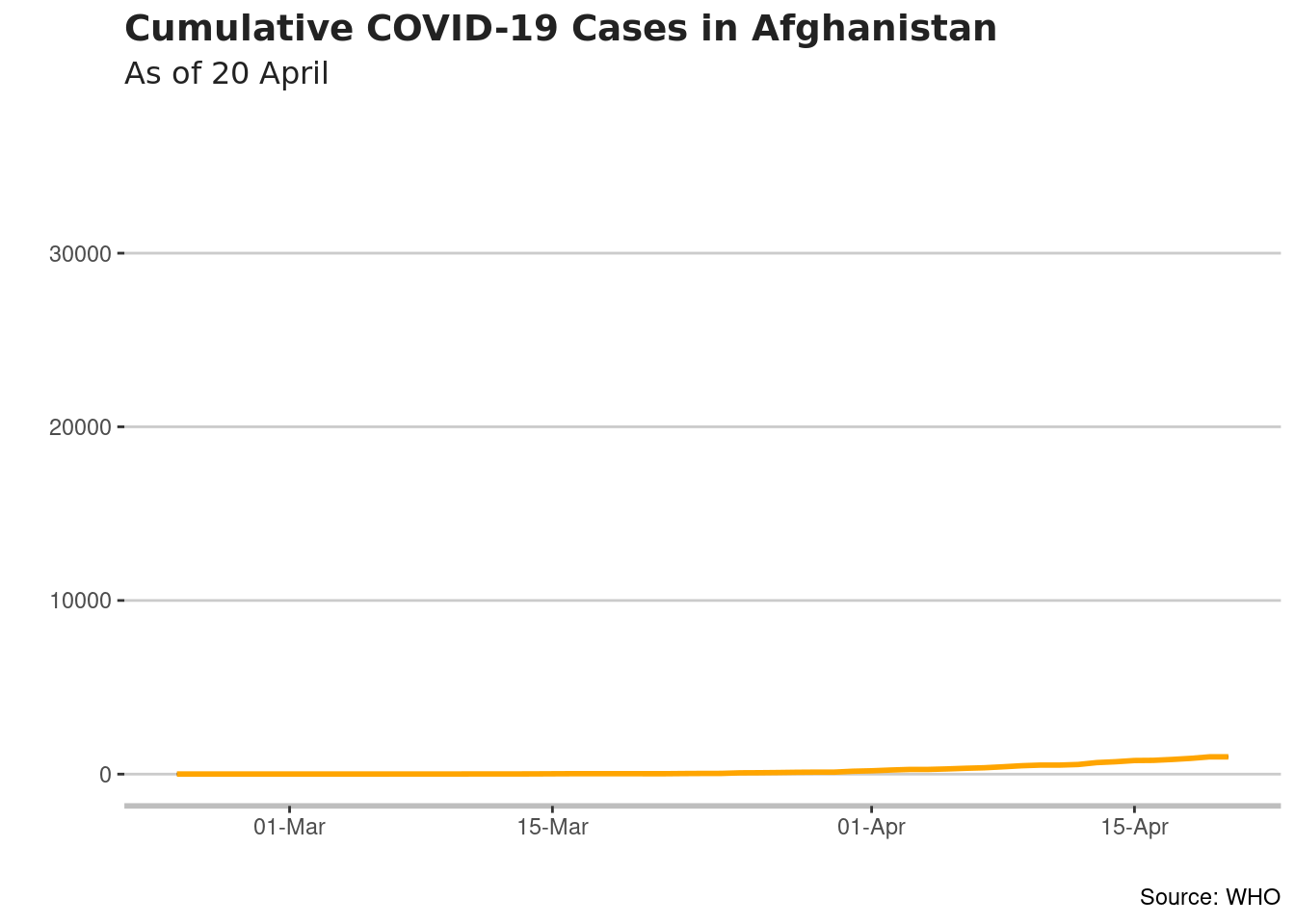
Format Vertical Axis
- Now we want to make the chart display in a Logarithmic scale. Starting with 10, the numbers will grow by a factor of ten - 10, 100, 1000, 10,000 etc.
myveryfirstplot  <- myveryfirstplot   +
                     scale_y_log10(breaks = c(10,100, 1000, 10000), labels = c(10,100, 1000, 10000))
myveryfirstplot
## Warning: Removed 104 row(s) containing missing values (geom_path).
## Warning: Removed 104 row(s) containing missing values (geom_path).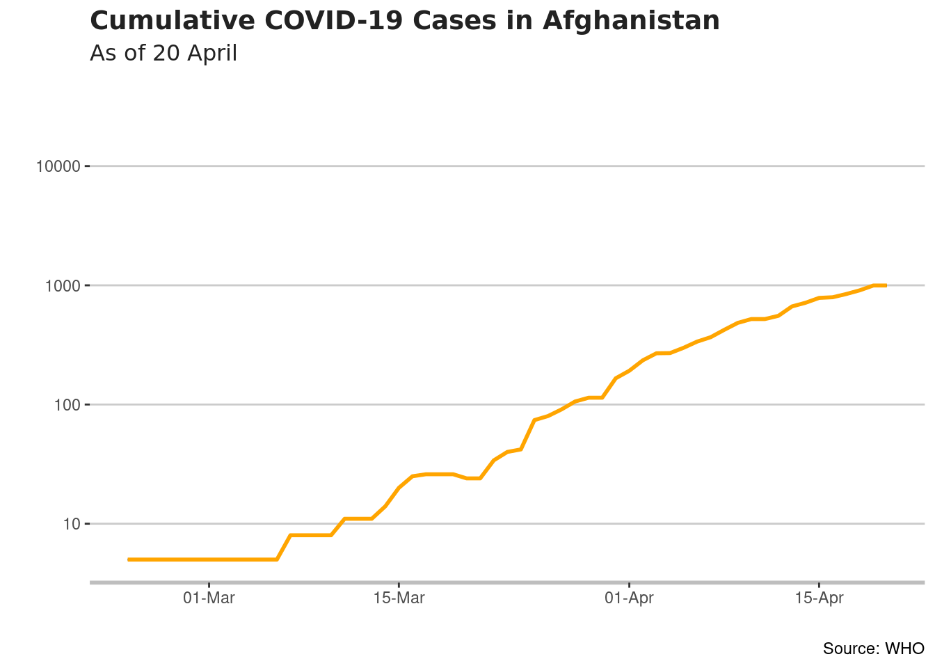
- Summary Figures: Let’s add some summary figures to give readers context. The total number of cumulative cases and the total number of deaths may be useful.
They are 996 cumulative cases (this is the same number presented in the graph at 20 April) and 33 deaths.
The white space in the upper left hand corner should be enough. To add such annotation
myveryfirstplot  <- myveryfirstplot   +

                 geom_label(aes( x = as.Date("2020-02-25"),
                                 y = 500,
                                 label = stringr::str_wrap("They are 996 cumulative cases and 33 deaths",
                                                           30)),
                           hjust = 0,
                           vjust = 0.5,
                           colour = "#555555",
                           fill = "white",
                           label.size = NA,
                           family = "Avenir",
                           size = 3)
myveryfirstplot
## Warning: Removed 104 row(s) containing missing values (geom_path).
## Warning: Removed 104 row(s) containing missing values (geom_path).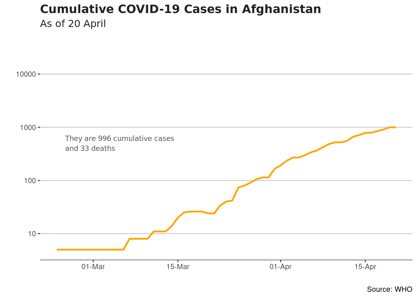
- One interesting capacity of ggplot2 package is the possiblility to create your own themes. The ggthemes package includes already some examples
For instance:
- Wall Street Journal theme
myveryfirstplot1  <- myveryfirstplot   +
                    theme_wsj()
myveryfirstplot1
## Warning: Removed 104 row(s) containing missing values (geom_path).
## Warning: Removed 104 row(s) containing missing values (geom_path).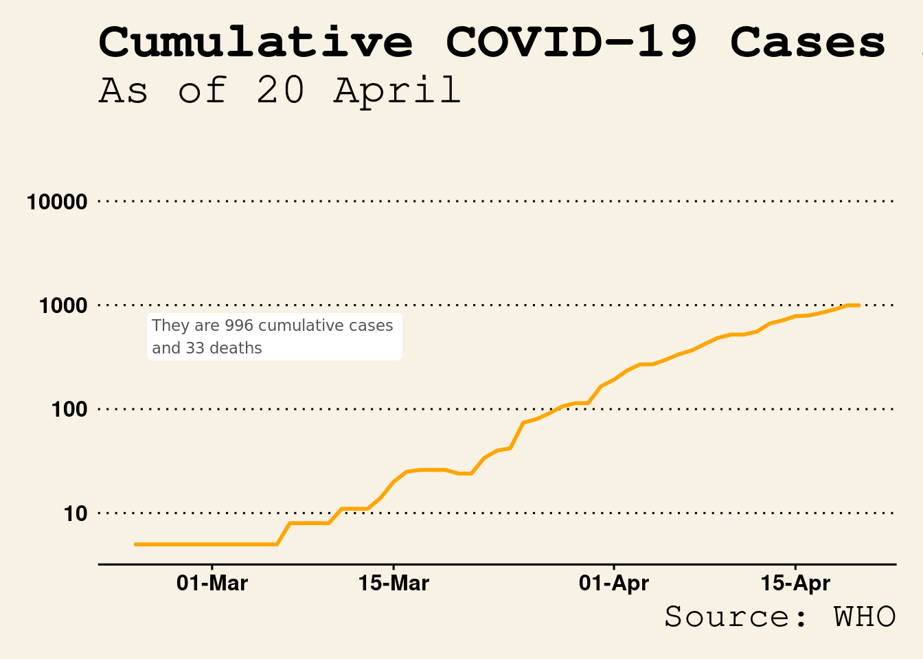
- The Economist theme
myveryfirstplot1  <- myveryfirstplot   +
                    theme_economist()
myveryfirstplot1
## Warning: Removed 104 row(s) containing missing values (geom_path).
## Warning: Removed 104 row(s) containing missing values (geom_path).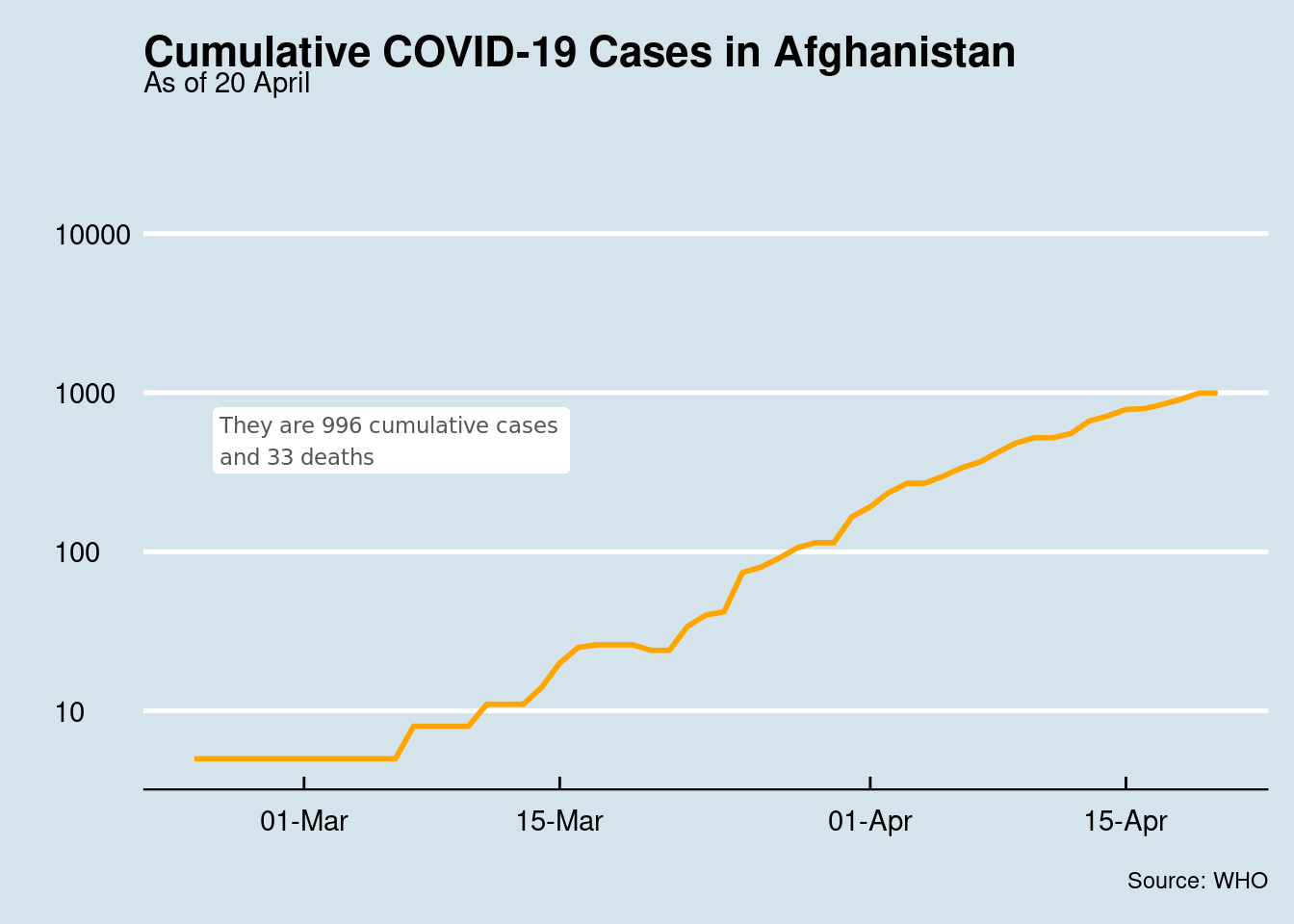
- Tufte Maximal Data, Minimal Ink Theme
myveryfirstplot1  <- myveryfirstplot   +
                    theme_tufte()
myveryfirstplot1
## Warning: Removed 104 row(s) containing missing values (geom_path).
## Warning: Removed 104 row(s) containing missing values (geom_path).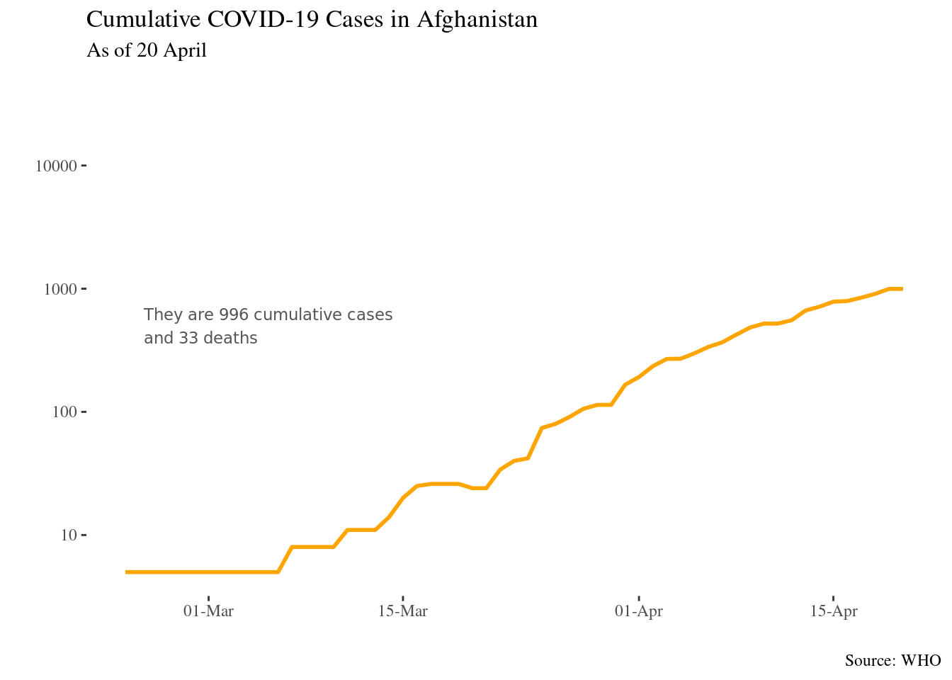
- Themes based on Stata graph schemes
myveryfirstplot1  <- myveryfirstplot   +
                    theme_stata()
myveryfirstplot1
## Warning: Removed 104 row(s) containing missing values (geom_path).
## Warning: Removed 104 row(s) containing missing values (geom_path).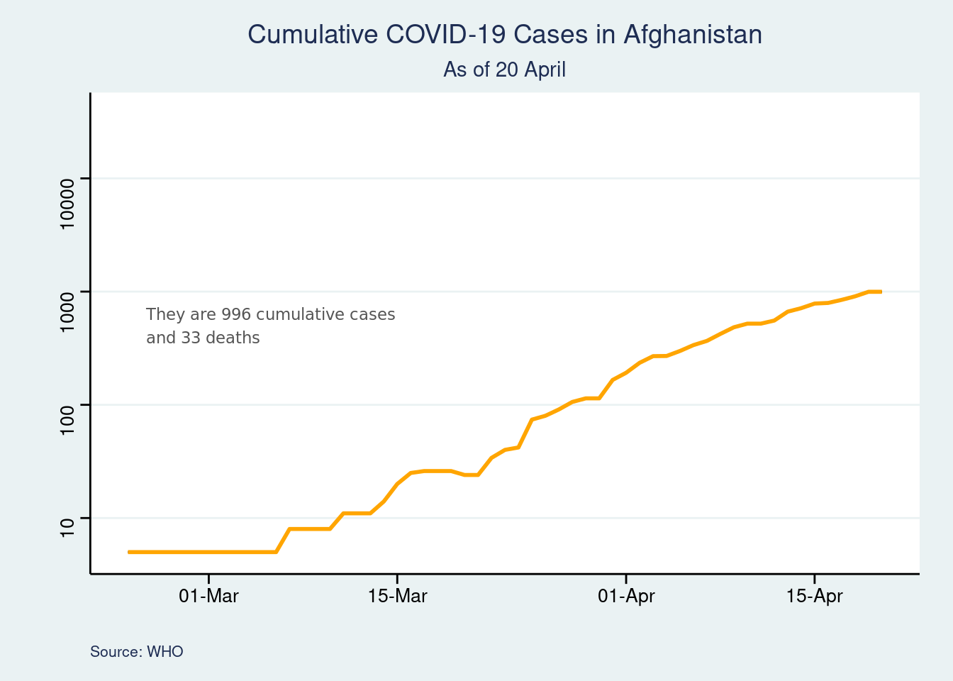
- Themes based on old Excel one
myveryfirstplot1  <- myveryfirstplot   +
                    theme_excel()
myveryfirstplot1
## Warning: Removed 104 row(s) containing missing values (geom_path).
## Warning: Removed 104 row(s) containing missing values (geom_path).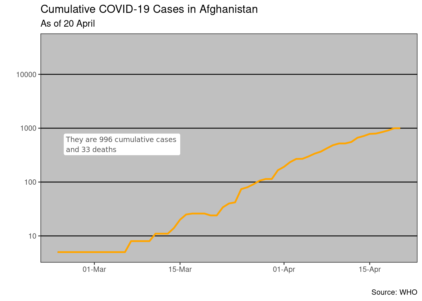
Using Chart
To use the chart in reports, presentations, etc. There are several options.
Copy and Paste: You can simply click on the chart, copy it and paste it into the document you want to use it in, such as MS Word or Powerpoint. You could also take a screenshot but would get
Export Chart: You can save it out as a separate file.
Embbed directly within a word or powerpoint file, by knitting your code notebook using different output.
You can learn more using Slow ggploting here
Share this post
Twitter
Google+
Facebook
Reddit
LinkedIn
StumbleUpon
Pinterest
Email