In this tutorial, We will see how to build a severity index using a key informant interview dataset. Building such index, also called [composite indicator](a composite indicator, is among the regular and expected task of any humanitarian data analyst.The objective is to summarize information into a simple indicator that can reduce information overflow. Severity index informs the sectoral and inter-sectoral discussions taking place as part of the Humanitarian Needs Overview (HNO) process, in particular facilitating a comparison of needs across geographic areas.
An approach to follow for this is described in the Annex1: Technical Guidance of the 2014 GUIDANCE: Humanitarian Needs Comparison Tool. Those guidance were provided with a complex and heavy excel tool that includes many macros script and 13 pages of narrative explanation to explain how it works.
Rather than using script through complicated Macros, using R is a good and easier alternative. Build those severity index though a documented and linear process brings more credibility in the severity index generation as the analysis becomes de facto entirely reproducible (as a difference with complex excel spreadsheet with macro formula spread around multiple worksheet). Existing packages such as R Compind package for composite indicators have already been developed and released as open source and therefore ready to be leveraged without any software procurement. The analysis below is fully reproducible and all code, including a summary power point, is accessible here
As the analysis workflow shall remain the same, anyone can take and study this tutorial source code, then change the dataset behind with their own in order to re-use it.
Why do you need statistical analysis for indicator composition?
When developing severity index, each steps comes with methodological questions:
- How to select and organised indicators?
- How to calculate and reshape them?
- How to assemble them together (aggregation and weighting).
The 2014 guidance advise to determine the weight of each sub-indicator through (often unreachable…) expert consensus. Such consensus, when obtained, usually takes (very long…) consultation and consideration with concerned stakeholders that are most of the time not statisticians themselves and will provide mostly guesstimates for each weight. This approach in the academic world is known as a budget allocation process (BAP), where set of chosen decision makers (e.g. a panel of experts) is given ‘n’ points to distribute to the indicators, or groups of indicators (e.g. dimensions), and then an average of the experts’ choices is used. An alternative to BAP, called “analytic hierarchy process - AHP”, is collect each expert opinion in a structured way through pairwise comparison. A rule of thumb for any expert judgement process is to have fewer than 10 indicators so that the approach is optimally executed cognitively, as such most of the time, they are not appropriate for the development of humanitarian severity index.
Arithmetic and geometric aggregation with equal weighting are originally also suggested in the guidance may also comes with assumption of compensability (i.e. Perfect substituability – compensates bad performance in one aspect with good performance in another) that are often not verified. Such points have been largely discussed in literature (see Benini, Aldo (2016). Severity measures in humanitarian needs assessments - Purpose,measurement, integration. Technical note - 8 August 2016 -. Geneva, Assessment CapacitiesProject (ACAPS)).
The OECD handbook for composite Indicators calculation also taught through the European Joint Research Training on Composite Indicators present a series of alternatives that can inform / help confirming or triangulate “expert-judgement” . As we will see below, some statistical method are easily accessible for R users in order to get indicators weights.
Installing packages
To get started, if you don’t have them already, the following packages are necessary.
## This function will retrieve the packae if they are not yet installed.
using <- function(...) {
    libs <- unlist(list(...))
    req <- unlist(lapply(libs,require,character.only = TRUE))
    need <- libs[req == FALSE]
    if (length(need) > 0) {
        install.packages(need)
        lapply(need,require,character.only = TRUE)
    }
}

## Getting all necessary package
using("readr","readxl","dplyr","ggplot2","corrplot","psych","bbplot",
      "scales","ggiraph","ggrepel","Compind","ggcorrplot","kableExtra",
      "reshape2","qgraph", "sf","cartography",
      "raster", "dismo", "xlsx", "rgdal", "SpatialPosition")
## Warning in fun(libname, pkgname): rgeos: versions of GEOS runtime 3.8.0-CAPI-1.13.1
## and GEOS at installation 3.7.1-CAPI-1.11.1differrm(using)
# This small function is used to have nicely left align text within
# charts produced with ggplot2
left_align <- function(plot_name, pieces){
grob <- ggplot2::ggplotGrob(plot_name)
n <- length(pieces)
grob$layout$l[grob$layout$name %in% pieces] <- 2
return(grob)
}
unhcr_style <- function() {
font <- "Lato"
ggplot2::theme(
#This sets the font, size, type and colour of text for the chart's title
plot.title = ggplot2::element_text(family = font, size = 20,
face = "bold", color = "#222222"),
# This sets the font, size, type and colour of text for the chart's subtitle,
# as well as setting a margin between the title and the subtitle
plot.subtitle = ggplot2::element_text(family = font, size = 16,
margin = ggplot2::margin(9,0,9,0)),
plot.caption = ggplot2::element_blank(),
# This sets the position and alignment of the legend, removes a title
# and backround for it and sets the requirements for any text within the legend.
# The legend may often need some more manual tweaking when it comes to its exact
# position based on the plot coordinates.
legend.position = "top",
legend.text.align = 0,
legend.background = ggplot2::element_blank(),
legend.title = ggplot2::element_blank(),
legend.key = ggplot2::element_blank(),
legend.text = ggplot2::element_text(family = font, size = 13, color = "#222222"),
# This sets the text font, size and colour for the axis test, as well as setting
# the margins and removes lines and ticks. In some cases, axis lines and axis
# ticks are things we would want to have in the chart
axis.title = ggplot2::element_blank(),
axis.text = ggplot2::element_text(family = font, size = 13, color = "#222222"),
axis.text.x = ggplot2::element_text(margin = ggplot2::margin(5, b = 10)),
axis.ticks = ggplot2::element_blank(),
axis.line = ggplot2::element_blank(),
# This removes all minor gridlines and adds major y gridlines.
# In many cases you will want to change this to remove y gridlines and add x gridlines.
panel.grid.minor = ggplot2::element_blank(),
panel.grid.major.y = ggplot2::element_line(color = "#cbcbcb"),
panel.grid.major.x = ggplot2::element_blank(),
# This sets the panel background as blank, removing the standard grey
# ggplot background colour from the plot
panel.background = ggplot2::element_blank(),
# This sets the panel background for facet-wrapped plots to white,
# removing the standard grey ggplot background colour and sets the title size
# of the facet-wrap title to font size 22
strip.background = ggplot2::element_rect(fill = "white"),
strip.text = ggplot2::element_text(size = 13, hjust = 0)
)
}Data set - Key Informant Interview for Hurricane Dorian, Bahamas
This dataset was collected at the beginning of November by IOM in the Bahamas. It covers Aback Island which has been severely hit by Hurricane Dorian on 1:3 September.
The dataset has been publicly released and is available through HDX here. An initial report has been produced.
data <- read_excel("DTM R3 DB Great-Little Abaco MSLA V4.xlsx", sheet = "BD")


## For some field the value '9999' has been entered - for the sake of analysis,
# we will assume that this correspond to answers 'no' - 0
# to replace multiple values in a data frame, looping through all columns might help.
for (i in seq_along(data)) {
    data[[i]][data[[i]] == "9999"] <- "0"
}
# This has converted numerci to character - let's bring them back to numeric
data[, c(3:ncol(data))] <- sapply(data[, c(3:ncol(data))], as.numeric)
## Warning in lapply(X = X, FUN = FUN, ...): NAs introduced by coercion## Point of control
#View(data[ ,c("J_107_VisitInmigration")])The data includes 188 variables and 23 records, each records corresponding to a location in Abaco.
Building the theoretical framework.
The original dataset already includes a data dictionary. The initial step is add more column to this dictionary in order to record the Severity theoretical framework.
A simple approach here is to regroup indicators by topics / composite dimensions. A composite dimension shall be apprehended as a construct i.e. a defined idea of sectoral severity that can only be measured through a number of simpler elements. A good exercise then is to try to give a definition of the type of sectoral severity that is looked at: The definition of the concept should give a clear sense of what is being measured by the composite index. It should be noted that not all indicators shall be blindly included: common sense shall be used to confirm that selected sub-indicators are indeed constructive or reflective of the actual dimension ‘construct’.
Looking at the spreadsheet from HDX, we can see that the data structure has already been reshaped / ‘hot coded’ as what is called a dummy variable so that each variable that includes modalities (categorical: i.e select_one with more than 2 modalities or select_multiple) is split into as many variable as there are modalities.
Single questions could then be extracted and had to be renamed both in terms of short code qid shortened Label for good appearance on charts qlabel. as a rule of thumb, a good variable name shall be self-explanatory (avoid q1, q2 , etc.) and very short - not more than 10 characters - A label should not be more than 80 characters and even less if possible.
Then we need to mention how the variable shall be used for the composite calculation, i.e. either “binary”, “value” or “scored” as we will see later.
### Need to implemet manually the analysis framework in the data dictionnary in order
# to get the calculation
dico <- read_excel("DTM R3 DB Great-Little Abaco MSLA V4.xlsx", sheet = "CatPregs")


## Checking the dico matche with dataframe --
dico1 <- as.data.frame(names(data))
names(dico1)[1] <- "cod_pregunta"
dico <- plyr::join(x = dico1 , y = dico , by = "cod_pregunta", type = "left" )
# Adding variable label in data frame
for (i in 1:nrow(data)) { attributes(data)$variable.labels[ i] <- as.character(dico[ i, c("label")]) }


rm(i, dico1)

## Now creating score variable and applying same direction to all of them!

#levels(as.factor(dico$Calculation))
#labels(dico)
subindicator <- dico[ dico$Calculation %in% c("binary", "value", "scored"), ]
subindicator.unique <- as.data.frame( unique(subindicator[ ,c("qid",  "question",
                                                              "qtype" ,
                                                              "Calculation", "Dimension",
                                                              "qlabel","justification",
                                                              "Polarity"   )]))

## Display the table
subindicator.unique2 <- as.data.frame( unique(subindicator[ ,c( "Dimension","qlabel",
                                                                "qtype" , "Calculation",
                                                                "Polarity"   )]))
row.names(subindicator.unique2) <- NULL


##  Frame with all dimensions
dimensions <- as.data.frame( unique(subindicator[ ,c( "Dimension" )]))
names(dimensions)[1] <- "Dimension"
## Get first Protection
i <- 2
  ## looping around dimensions
this.dimension <- as.character(dimensions[i,1])

subindicator.unique3 <- as.data.frame( subindicator.unique2[ subindicator.unique2$Dimension == this.dimension ,
                                                  c( "qlabel",  "Calculation",
                                                                "Polarity"   )])
row.names(subindicator.unique3) <- NULL

knitr::kable(subindicator.unique3, caption = "Theoretical Framework") %>%
           kable_styling(bootstrap_options = c("striped", "bordered",
                                               "condensed", "responsive"),
font_size = 9)| qlabel | Calculation | Polarity |
|---|---|---|
| Concerning hierarchy of unmet needs | scored | Negative (the higher score, the more severe) |
| Community Relation Level | scored | Negative (the higher score, the more severe) |
| Relation with Host Community | scored | Negative (the higher score, the more severe) |
| Women Good safety | scored | Positive (the higher score, the less severe) |
| Men Good Safety | scored | Positive (the higher score, the less severe) |
| Child Good Safety | scored | Positive (the higher score, the less severe) |
| Reported Security Incident | binary | Negative (the higher score, the more severe) |
| Positive Safe/Recreational Places | binary | Positive (the higher score, the less severe) |
| Positive Diversity of Information source | scored | Positive (the higher score, the less severe) |
Calculating each sub-indicator value
The survey has mostly responses of types: ‘select_one’ and ‘select_multiple’. Indeed, collecting reliable numeric value is a well-knwon limitation of key-informant based survey.
Different calculations were used depending on the type of questions:
For binary questions, negative questions receive a score of 1 when answered positively, such as answering
no, and the score was lowered towards 0 with each negative response given. This will require as we will see below a normalization based on ranking in order to ensure that geometric means can be done. Ridit analysis essentially transforms ordinal data to a probability scale (one could call it a virtual continuous scale). The term actually stands for relative to an identified distribution integral transformationSome
select_oneresponse choices is ordinal data with an imputed ordered response, where the max score is given either to the best or worst possible choice.Other
select_multiplequestions might have many dummy variables corresponded to the question and the sum of these scores represented the highest score possible. Otherselect_multipleresponse choices are discrete choice data with nominal responses; each answer in theselect_multipleare weighted according to importance or criticality.
## Creating scores for each of those indicator ###########
## Num col where indic will start to be appended
numcol1 <- ncol(data) + 1
numcol <- ncol(data)

## looping around each new sub indicator to create
for (j in 1:nrow(subindicator.unique)) {

    # j <- 2
    this.indicator.comp <- as.character(subindicator.unique[ j, c("Calculation")])
    this.indicator.type <- as.character(subindicator.unique[ j, c("qtype")])
    this.indicator.name <- as.character(subindicator.unique[ j, c("qid")])
    this.indicator.label <- as.character(subindicator.unique[ j, c("qlabel")])
    this.indicator.question <- as.character(subindicator.unique[ j, c("question")])
    this.indicator.Polarity <- as.character(subindicator.unique[ j, c("Polarity")])
    this.indicator.Dimension <- as.character(subindicator.unique[ j, c("Dimension")])

    ## let's add a variable in the data frame and give it the indic name
    numcol <- numcol + 1
    data[ , numcol] <- ""
    names(data)[numcol] <- this.indicator.name
    attributes(data)$variable.labels[numcol] <- this.indicator.label

    ## Display where we are in the console - always usefull to debug!
    ## Take the # when playing with the script
    #cat(paste0("\n\n===  Indicator: ", j, "-",this.indicator.Dimension ,
    #           "-",this.indicator.label ,"\n",this.indicator.comp ,
    #           "-",this.indicator.Polarity ,"\n"))

    ## Now accounting for 2 distinct cases to get my calculation
    ## "binary" / "value" or "scored"

      ## If it's a score, we need to sum up all scores for that questions  #####
      # - independently of wether it's a select_one or select_multiple -
      if (this.indicator.comp == "scored" ) {
      ## get the correponding value var
        this.value.var <- as.character(subindicator[ subindicator$question == this.indicator.question,
                                                     c("cod_pregunta") ])
        this.subset <- data[ , this.value.var]

        ## Now get an apply the coeffcient
        this.subsetscore <- t(as.data.frame(subindicator[ subindicator$cod_pregunta %in% this.value.var,
                                                          c("scoremodality") ]))

      ## multiply data frame by a vector
      this.subset3 <- data.frame(mapply(`*`,this.subset, this.subsetscore, SIMPLIFY = FALSE))
      #str(this.subset3)
      # this.subset4 <- cbind(this.subset3,  rowSums(this.subset3, na.rm = TRUE))

      #cat(paste0("Calculation of Indicator: ", j, "\n"))
      ## Get the sum of the row
      data[ , numcol] <- rowSums(this.subset3, na.rm = TRUE)
    }


    ## If it's a  value, we just take the value of that binary  #####-
    if (this.indicator.comp %in% c("value")) {
      ## get the correponding value var
      this.value.var <- as.character(dico[ dico$question == this.indicator.question,
                                           c("cod_pregunta") ])
      ## Apply the value
      #cat(paste0("Calculation of Indicator: ", j, "\n"))
      data[ , numcol] <- data[ , this.value.var]
    }

    ## If it's a binary , we add 1 to avoid zero value #####-
    if (this.indicator.comp %in% c("binary")) {
      ## get the correponding value var
      this.value.var <- as.character(dico[ dico$question == this.indicator.question,
                                           c("cod_pregunta") ])

      #cat(paste0("Calculation of Indicator: ", j, "\n"))

      ## Apply the value + 1 to avoid zero value
      data[ , numcol] <- data[ , this.value.var] + 1

      ## Ridit transformation
      # data[ , numcol] <- (cumsum(data[ , this.value.var]) - .5 *
      #                       data[ , this.value.var]) /
      #                          sum(data[ , this.value.var])

    }

    ## clean
    rm(this.indicator.comp, this.indicator.type, this.indicator.name,
       this.indicator.label, this.indicator.question, this.indicator.Polarity ,
       this.indicator.Dimension, this.subset, this.subset3, this.subsetscore, this.value.var )
}
Sub-Indicator Polarity & Data Normalization,
We can now isolate our new numeric and scaled indicators within a matrix as this object type will be required for the rest of the calculations.
First, we need to eliminate indicators with poor discrimination capacity, i.e. when all values are the sames.
## Double Checking results
#View(data[ , numcol1:ncol(data)])
indic <- data[ , numcol1:ncol(data)]

### Remove var when standard deviation is 0
indic2 <- indic[, sapply(indic, function(x) { sd(x) != 0} )]

## For some field, we still have indic with zero value -
## This a data quality issue that shows that some modalities were missing
# for select_one or select_multiple
### We assume that this account for not severe situation - i.e. replaced by one
for (i in seq_along(indic2)) {
    indic2[[i]][indic2[[i]] == "0"] <- "1"
}
# This has converted from numeric to character - let's bring them back to numeric
indic2 <- sapply(indic2, as.integer)

## Refresh my dictionnary of indic
subindicator.unique2 <- subindicator.unique[ subindicator.unique$qid
                                             %in% names(as.data.frame(indic2)), ]

## Transform this object as a matrix and inject location name as row.names
indic.matrix <- as.matrix(indic2)
row.names(indic.matrix) <- data$C_101_name
The polarity of a sub-indicator is the sign of the relationship between the indicator and the phenomenon to be measured (e.g., in a well-being index, “GDP per capita” has ‘positive’ polarity and “Unemployment rate” has ‘negative’ polarity). In this case, we have 2 options for such directional adjustments:
- “Negative (the higher score, the more severe)”
- “Positive (the higher score, the less severe)”
This component is accounted for during the normalization process below.
Data Normalization allows for Adjustments of distribution (similar range of variation) and scale (common scale) of sub-indicators that may reflect different units of measurement and different ranges of variation.
Due to the structure of the indicators, distinct approaches of normalization shall be considered in order to avoid having zero value that would create issues for geometric means aggregation. Different normalization methods are available through the function normalise_ci and lead to different results:
A z-score approach
method = 1(Imposes a distribution with mean zero and variance 1). Standardized scores which are below average will become negative, implying that further geometric aggregation will be prevented.A min-max approach
method = 2(same range of variation [0,1]) but not same variance).This method is very sensitive to extreme values/outliersA ranking method
method = 3. Scores are replaced by ranks – e.g. the highest score receives the first ranking position (rank 1).
## Retrieve polarity from dictionnary
for (i in 1:nrow(subindicator.unique2)) {
  if (subindicator.unique2[ i, c("Polarity")] == "Negative (the higher score, the more severe)")
    {subindicator.unique2[ i, c("polarity")]  <- "NEG"} else
    {subindicator.unique2[ i, c("polarity")]  <- "POS"}
 }
subindicator.unique2$dir <- 1

## Case 1
subindicator.scored <- subindicator.unique2[ subindicator.unique2$Calculation == "scored", ]
var.scored <- as.character(subindicator.scored[ , c("qid") ])
indic.matrix.scored <- indic.matrix[ , var.scored ]
indic.matrix.scored.obj <- normalise_ci(indic.matrix.scored,
                                     c(1:ncol(indic.matrix.scored)),
                                     polarity =  as.character(subindicator.scored$polarity ),
                                     method = 3)

## Case 2
# subindicator.value <- subindicator.unique2[ subindicator.unique2$Calculation == "value", ]
# var.value <- as.character(subindicator.value[ , c("qid") ])
# indic.matrix.value <- indic.matrix[ , var.value ]
# indic.matrix.value.obj <- normalise_ci(indic.matrix.value,
#                                      c(1:ncol(indic.matrix.value)),
#                                      polarity =  as.character(subindicator.value$polarity ),
#                                      method = 2)

## Case 3
subindicator.binary <- subindicator.unique2[ subindicator.unique2$Calculation == "binary", ]
var.binary <- as.character(subindicator.binary[ , c("qid") ])
indic.matrix.binary <- indic.matrix[ , var.binary ]
indic.matrix.binary.obj <- normalise_ci(indic.matrix.binary,
                                     c(1:ncol(indic.matrix.binary)),
                                     polarity =  as.character(subindicator.binary$polarity ),
                                     method = 3)

## Binding this together so that we have the full normalised matrix
indic.matrix.norm <- cbind(indic.matrix.scored.obj$ci_norm,
                          # indic.matrix.value.obj$ci_norm,
                           indic.matrix.binary.obj$ci_norm)

## Clean the work environment
rm( subindicator.unique,
 #  subindicator.value, var.value , indic.matrix.value, indic.matrix.value.obj,
   subindicator.binary, var.binary , indic.matrix.binary, indic.matrix.binary.obj,
   subindicator.scored, var.scored , indic.matrix.scored, indic.matrix.scored.obj   )
Correlation analysis
The investigation of the structure of simple indicators can be done by means of correlation analysis.
We will check such correlation first within each dimension, using the ggcorrplot package. ’
##  Frame with all dimensions
# dimensions <- as.data.frame( unique(subindicator[ ,c( "Dimension" )]))
# names(dimensions)[1] <- "Dimension"

## Creating severity subindice on each dimensions with Data Envelopment analysis #####

#for (i in 1:nrow(dimensions)) {
#for (i in 1:2) {
  # i <- 2
  # ## looping around dimensions
  # this.dimension <- as.character(dimensions[i,1])
  ## subset related indicator names
  this.indicators <- as.character(subindicator.unique2[ subindicator.unique2$Dimension == this.dimension,
                                                        c("qid") ])
  this.indicators.label <- as.character(subindicator.unique2[ subindicator.unique2$Dimension == this.dimension,
                                                        c("qlabel") ])
  ##subset matrix & df
  this.indic.matrix.norm <- indic.matrix[ , this.indicators]
  this.indic.df <- indic2[ , this.indicators]

### Check correlation
corr.matrix <- cor(this.indic.matrix.norm, method = "pearson",  use = "pairwise.complete.obs")


## replace with Label inside the matrix
corr.matrix1 <- corr.matrix
rownames(corr.matrix1) <- as.character(subindicator.unique2[subindicator.unique2$qid %in% rownames(corr.matrix), c("qlabel")])
colnames(corr.matrix1) <- as.character(subindicator.unique2[subindicator.unique2$qid %in% colnames(corr.matrix), c("qlabel")])

plot1 <- ggcorrplot(corr.matrix1 ,
                    method = "circle",
                    hc.order = TRUE,
                    type = "upper") +
  labs(title = paste0( "Severity Indicators for ",this.dimension ),
       subtitle = "Identified Correlation between indicators",
       caption = "Correlation level = dot size, Positive Correlation  = Red - Negative = Blue",
       x = NULL, y = NULL) +
  bbc_style() +
  theme( plot.title = element_text(size = 13),
         plot.subtitle = element_text(size = 11),
         plot.caption = element_text(size = 7, hjust = 1),
         axis.text = element_text(size = 7),
         strip.text.x = element_text(size = 7),
         axis.text.x = element_text(angle = 45, hjust = 1),
         legend.position = "top",
         legend.box = "horizontal",
         legend.text = element_text(size = 9),
         panel.grid.major.x = element_line(color = "#cbcbcb"),
         panel.grid.major.y = element_line(color = "#cbcbcb"))
ggpubr::ggarrange(left_align(plot1, c("subtitle", "title")), ncol = 1, nrow = 1)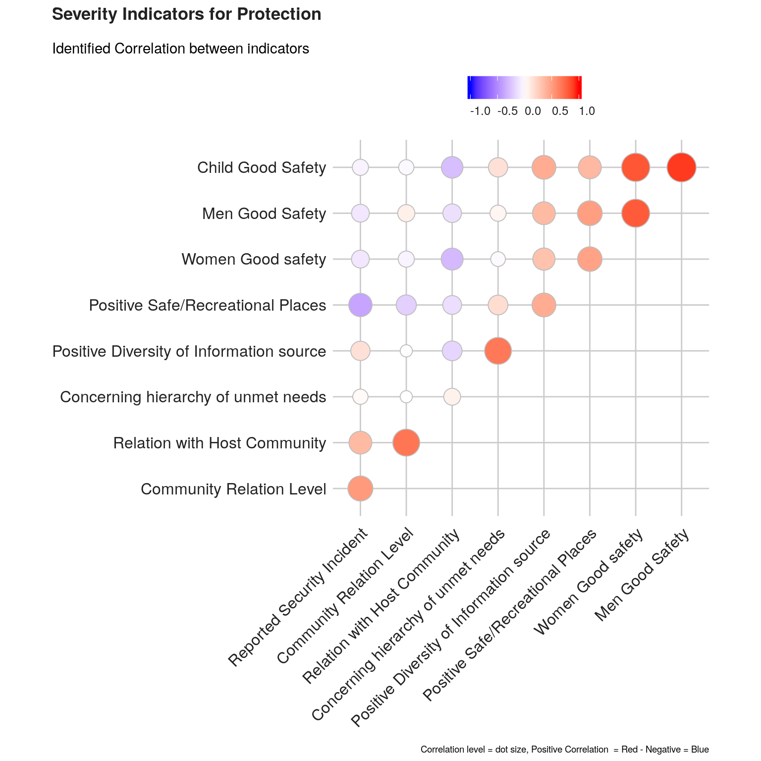
Another approach to better visualize correlation between indicators is to represent them through a network with the ggpraph package.
qgraph(cor(this.indic.matrix.norm),
     # shape = "circle",
     # posCol = "darkgreen",
     # negCol = "darkred",
     # threshold = "bonferroni", #The threshold argument can be used to remove edges that are not significant.
     # sampleSize = nrow(scores.this.norm),
     # graph = "glasso",
       esize = 35, ## Size of node
       vsize = 6,
       vTrans = 600,
       posCol = "#003399", ## Color positive correlation Dark powder blue
       negCol = "#FF9933", ## Color negative correlation Deep Saffron
       alpha = 0.05,
       cut = 0.4, ## cut off value for correlation
       maximum = 1, ## cut off value for correlation
       palette = 'pastel', # adjusting colors
       borders = TRUE,
       details = FALSE,
       layout = "spring",
       nodeNames = this.indicators.label ,
       legend.cex = 0.4,
       title = paste0("Correlations Network for severity indicators related ",this.dimension ),
       line = -2,
       cex.main = 2)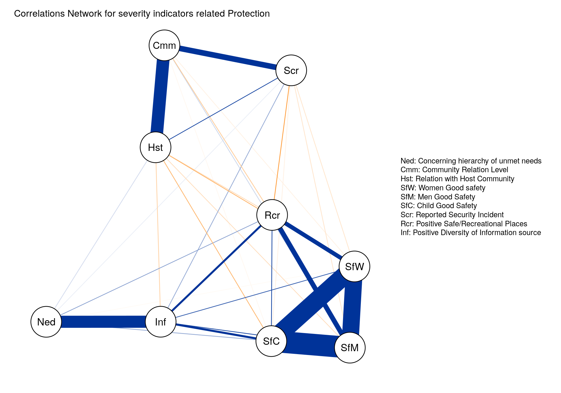
Consistency between indicators
Cronbach’s alpha, (or coefficient alpha), developed by Lee Cronbach in 1951, measures reliability (i.e. how well a test measures what it should: measure of the stability of test scores), or internal consistency.
As a rule of thumbs, a score of more than 0.7 indicates an acceptable level of consistency:
- A high level for alpha may mean that all indicators are highly correlated (meaning we have redundant indicators representing the same thing…).
- A low value for alpha may mean that there are not enough indicators or that the indicators are poorly interrelated.
’
Cronbach.this <- psych::alpha(this.indic.matrix.norm, check.keys = TRUE)

cat(paste0("The Cronbach Alpha measure of consistency for this combination of indicators is  ", round(Cronbach.this$total$std.alpha, 2), "\n." ) )
The Cronbach Alpha measure of consistency for this combination of indicators is 0.77
.Aggregation & Weighting
For weighting, the main issue to address is related to the concept of compensability. Namely the question is to know to what extent can we accept that the high score of an indicator go to compensate the low score of another indicator? This problem of compensability is intertwined with the issue of attribution of weights for each sub-indicator in order to calculate the final aggregation.
We can foresee that using “equal weight” (all indicators account for the same in the final index) and “arithmetic aggregation” (all indicators are substituable) is unlikely to depict the complex issue of Humanitarian Severity and is likely to comes with the risk of misrepresenting the reality.
Various methods are available within the Compind package are described below. This R package is also available through a ShinyApp. We will then share the code to use them based on our example.
Benefit of the Doubt approach (BoD)
This method is the application of Data Envelopment Analysis (DEA) to the field of composite indicators. It was originally proposed by Melyn and Moesen (1991) to evaluate macroeconomic performance. ACAPS has prepared an excellent note on The use of data envelopment analysis to calculate priority scores in needs assessments.
BoD approach offers several advantages:
Weights are endogenously determined by the observed performances and benchmark is not based on theoretical bounds, but it’s a linear combination of the observed best performances.
Principle is easy to communicate: since we are not sure about the right weights, we look for ”benefit of the doubt” weights (such that your overall relative performance index is as high as possible).
CI_BoD_estimated = ci_bod(this.indic.matrix.norm,
                          indic_col = (1:ncol(this.indic.matrix.norm)))

ci_bod_est <- as.data.frame( CI_BoD_estimated$ci_bod_est)
names(ci_bod_est) <- "Benef_Doubt"
Directional Benefit of the Doubt (D-BoD)
Directional Benefit of the Doubt (D-BoD) model enhances non-compensatory property by introducing directional penalties in a standard BoD model in order to consider the preference structure among simple indicators. This method is described in the article Enhancing non compensatory composite indicators: a directional proposal.
## Endogenous weight - no zero weight --
CI_Direct_BoD_estimated <-  ci_bod_dir(this.indic.matrix.norm,
                                       indic_col = (1:ncol(this.indic.matrix.norm)),
                                       dir = as.numeric(subindicator.unique2[subindicator.unique2$Dimension == this.dimension , c("dir")] ))

ci_bod_dir_est <- data.frame(CI_Direct_BoD_estimated$ci_bod_dir_est)
names(ci_bod_dir_est) <- "Benef_Doubt_Dir"
Robust Benefit of the Doubt approach (RBoD)
This method is the robust version of the BoD method. It is based on the concept of the expected minimum input function of order-m so “in place of looking for the lower boundary of the support of F, as was typically the case for the full-frontier (DEA or FDH), the order-m efficiency score can be viewed as the expectation of the maximal score, when compared to m units randomly drawn from the population of units presenting a greater level of simple indicators”, Daraio and Simar (2005). This method is described with more detail in the article Robust weighted composite indicators by means of frontier methods with an application to European infrastructure endowment.
CI_RBoD_estimated <-  ci_rbod(this.indic.matrix.norm,
                              indic_col = (1:ncol(this.indic.matrix.norm)),
                              M = 20,  #The number of elements in each sample.
                              B = 200) #The number of bootstap replicates.

ci_rbod_est <- data.frame(CI_RBoD_estimated$ci_rbod_est)
names(ci_rbod_est) <- "Benef_Doubt_Rob"
Benefit of the Doubt approach (BoD) index with constraints on weights
This method allows for constraints (so that there is none not valued) and with a penalty as proposed by Mazziotta - Pareto (also adopted by the Italian National Institute of Statistics). This method is described in the article Geometric mean quantity index numbers with Benefit-of-the-Doubt weights
CI_BoD_MPI_estimated = ci_bod_constr_mpi(this.indic.matrix.norm,
                                          indic_col = (1:ncol(this.indic.matrix.norm)),
                                          up_w = 1,
                                          low_w = 0.1,
                                          penalty = "POS")

ci_bod_constr_est_mpi <- data.frame(CI_BoD_MPI_estimated$ci_bod_constr_est_mpi)
names(ci_bod_constr_est_mpi) <- "Benef_Doubt_Cons"
Factor analysis
This method groups together simple indicators to estimate a composite indicator that captures as much as possible of the information common to individual indicators.
##  Doing PCA with ci_factor.R
# If method = "ONE" (default) the composite indicator estimated values are equal to first component scores;
# if method = "ALL" the composite indicator estimated values are equal to component score multiplied by its proportion variance;
# if method = "CH" it can be choose the number of the component to take into account.
dimfactor <- ifelse(ncol(this.indic.matrix.norm) > 2, 3, ncol(this.indic.matrix.norm))
CI_Factor_estimated <-  ci_factor(this.indic.matrix.norm,
                                  indic_col = (1:ncol(this.indic.matrix.norm)),
                                  method = "CH",  # if method = "CH" it can be choose the number of the component to take into account.
                                  dim = dimfactor)
ci_factor_est <- data.frame( CI_Factor_estimated$ci_factor_est)
names(ci_factor_est) <- "Factor"
Mean-Min Function (MMF)
This method is an intermediate case between arithmetic mean, according to which no unbalance is penalized, and min function, according to which the penalization is maximum. It depends on two parameters that are respectively related to the intensity of penalization of unbalance (alpha) and intensity of complementarity (beta) among indicators. “An unbalance adjustment method for development indicators”
CI_mean_min_estimated <- ci_mean_min(this.indic.matrix.norm,
                                     indic_col = (1:ncol(this.indic.matrix.norm)),
                                     alpha = 0.5,  #intensity of penalization of unbalance  (alpha)
                                     beta = 1) # intensity of complementarity (beta) among indicators

ci_mean_min_est <- data.frame( CI_mean_min_estimated$ci_mean_min_est)
names(ci_mean_min_est) <- "Mean_Min"
Geometric aggregation
This method uses the geometric mean to aggregate the single indicators and therefore allows to bypass the full compensability hypothesis using geometric mean. Two weighting criteria are possible: EQUAL: equal weighting and BOD: Benefit-of-the-Doubt weights following the Puyenbroeck and Rogge (2017) approach.
CI_Geom_estimated = ci_geom_gen(this.indic.matrix.norm,
                                indic_col = (1:ncol(this.indic.matrix.norm)),
                                meth = "EQUAL",
                                ## "EQUAL" = Equal weighting set, "BOD" = Benefit-of-the-Doubt weighting set.
                                up_w = 1,
                                low_w = 0.1,
                                bench = 1)
# Row number of the benchmark unit used to normalize the data.frame x.

ci_mean_geom_est <- data.frame( CI_Geom_estimated$ci_mean_geom_est)
names(ci_mean_geom_est) <- "Mean_Geom"
Mazziotta-Pareto Index (MPI)
This method is is a non-linear composite index method which transforms a set of individual indicators in standardized variables and summarizes them using an arithmetic mean adjusted by a “penalty” coefficient related to the variability of each unit (method of the coefficient of variation penalty).
CI_MPI_estimated <- ci_mpi(this.indic.matrix.norm,
                           indic_col = (1:ncol(this.indic.matrix.norm)),
                           penalty = "NEG")  # Penalty direction; ”POS” (default) in case of increasing
#  or “positive” composite index (e.g., well-being index),
#  ”NEG” in case of decreasing or “negative” composite
#  index (e.g., poverty index).

ci_mpi_est <- data.frame( CI_MPI_estimated$ci_mpi_est)
names(ci_mpi_est) <- "Mazziotta_Pareto"
Wroclaw taxonomy method
This last method (also known as the dendric method), originally developed at the University of Wroclaw, is based on the distance from a theoretical unit characterized by the best performance for all indicators considered; the composite indicator is therefore based on the sum of euclidean distances from the ideal unit and normalized by a measure of variability of these distance (mean + 2*std).
CI_wroclaw_estimated <-  ci_wroclaw(this.indic.matrix.norm,
                                    indic_col = (1:ncol(this.indic.matrix.norm)))

ci_wroclaw_est <- data.frame( CI_wroclaw_estimated$ci_wroclaw_est)
names(ci_wroclaw_est) <- "Wroclaw"
Visualise output
In a table
this.indic.matrix.norm2 <- cbind( #row.names(scores.this),
  ci_bod_est, # Benefit of the Doubt approach
  ci_rbod_est, # Robust Benefit of the Doubt approach
  ci_bod_dir_est, # Directional Robust Benefit of the Doubt approach
  ci_bod_constr_est_mpi, # Robust Benefit of the Doubt approach with constraint
  ci_factor_est, # Factor analysis  componnents
  ci_mean_geom_est, # Geometric aggregation
  ci_mean_min_est, # Mean-Min Function
  ci_mpi_est, # Mazziotta-Pareto Index
  ci_wroclaw_est) # Wroclaw taxonomy method


kable(this.indic.matrix.norm2, caption = "Composite with different algorithm") %>%
kable_styling(bootstrap_options = c("striped", "bordered", "condensed", "responsive"), font_size = 9)| Benef_Doubt | Benef_Doubt_Rob | Benef_Doubt_Dir | Benef_Doubt_Cons | Factor | Mean_Geom | Mean_Min | Mazziotta_Pareto | Wroclaw | |
|---|---|---|---|---|---|---|---|---|---|
| Bahama Palm Shores | 1.0000000 | 1.313041 | 1.0000000 | 0.9797208 | 0.5494164 | 2.528472 | 105.32789 | 133.43501 | 0.1977937 |
| Bahamas Coral Island | 0.6666667 | 1.000000 | 0.6666667 | 0.2857143 | -0.6148423 | 1.000000 | 88.84537 | 91.34200 | 0.8691159 |
| Blackwood | 1.0000000 | 1.307190 | 1.0000000 | 0.8219178 | 0.0986371 | 2.472720 | 104.62942 | 138.63625 | 0.5959116 |
| Casuarina Point | 0.9189189 | 1.058668 | 0.8500000 | 0.7792208 | 0.3141703 | 2.026346 | 102.12890 | 128.78828 | 0.4523715 |
| Cedar Harbour | 1.0000000 | 1.006711 | 1.0000000 | 0.7843137 | 0.0381540 | 2.119724 | 103.94474 | 131.98927 | 0.6059276 |
| Central Pines | 0.6666667 | 1.000000 | 0.6666667 | 0.3333333 | -0.6180444 | 1.080060 | 89.02142 | 91.69567 | 0.8391677 |
| Cherokee Sound | 1.0000000 | 1.033592 | 1.0000000 | 0.8674699 | 0.2977712 | 2.363792 | 108.61128 | 152.76616 | 0.5485811 |
| Cooper’s Town | 1.0000000 | 1.002506 | 1.0000000 | 0.6122449 | -0.1351963 | 1.851749 | 100.95427 | 135.52080 | 0.7046651 |
| Crossing Rocks | 1.0000000 | 1.005025 | 1.0000000 | 0.6486486 | 0.4742669 | 1.937082 | 100.63741 | 128.10570 | 0.6696285 |
| Crown Heaven | 1.0000000 | 1.136364 | 1.0000000 | 0.8955224 | 0.2913669 | 2.440570 | 107.14472 | 147.50475 | 0.5146147 |
| Dundas Town | 1.0000000 | 1.010952 | 1.0000000 | 0.4615385 | -0.5514938 | 1.317981 | 93.87114 | 106.82388 | 0.7541743 |
| Fire Road | 0.8000000 | 1.000000 | 0.7500000 | 0.3703704 | -0.2756593 | 1.360790 | 91.19001 | 96.13258 | 0.8155244 |
| Fox Town | 1.0000000 | 1.003764 | 1.0000000 | 0.7547170 | 0.3914990 | 2.000000 | 101.78035 | 129.74709 | 0.6059276 |
| Great Cistern | 1.0000000 | 1.269841 | 1.0000000 | 0.5617978 | 0.2907193 | 1.757528 | 94.23900 | 102.84506 | 0.6628530 |
| Leisure Lee | 1.0000000 | 1.000000 | 1.0000000 | 0.5882353 | 0.1610722 | 1.759955 | 99.00941 | 122.01924 | 0.7152622 |
| Little Harbour | 1.0000000 | 1.002506 | 1.0000000 | 0.3428571 | 0.1722624 | 1.660551 | 95.23452 | 99.42675 | 0.8283392 |
| Marsh Harbour | 0.7142857 | 1.003584 | 0.6666667 | 0.5166052 | -0.3414096 | 1.448089 | 103.96229 | 153.76873 | 0.5430675 |
| Mount Hope | 1.0000000 | 1.184600 | 1.0000000 | 0.9448819 | 0.3921176 | 2.472720 | 104.99752 | 135.38070 | 0.4523715 |
| Murphy Town | 0.6666667 | 1.000000 | 0.6666667 | 0.4411765 | -0.5236980 | 1.220285 | 89.89036 | 92.95444 | 0.7561668 |
| Sandy Point | 1.0000000 | 1.283444 | 1.0000000 | 0.8290816 | 0.1011147 | 2.337081 | 118.34135 | 277.19642 | 0.1900341 |
| Spring City | 0.8000000 | 1.000000 | 0.7500000 | 0.3703704 | -0.2756593 | 1.360790 | 91.19001 | 96.13258 | 0.8155244 |
| Treasure Cay | 1.0000000 | 1.038961 | 1.0000000 | 0.4545455 | -0.0502422 | 1.817121 | 100.95502 | 129.50441 | 0.7067973 |
| Wood Cay | 1.0000000 | 1.053556 | 1.0000000 | 0.6000000 | -0.1863227 | 1.793495 | 99.18593 | 118.39332 | 0.7110423 |
As we can see some of the potential aggregation algorithm are not providing results from some location. We will therefore exclude them from the rest of the analysis.
## Eliminate automatically method that could not score some elements
this.indic.matrix.norm22 <- this.indic.matrix.norm2[, colSums(this.indic.matrix.norm2 != 0, na.rm = TRUE) > 0]

## Check if sum is  zero
this.indic.matrix.norm22 <- this.indic.matrix.norm22[, colSums(this.indic.matrix.norm22 != 0, na.rm = TRUE)  == nrow(this.indic.matrix.norm22)]

## Remove indic if standard deviation is o
this.indic.matrix.norm22 <- this.indic.matrix.norm22[, sapply(this.indic.matrix.norm22, function(x) { sd(x) != 0} )]

## Remove “NaN” or “Not a Number
this.indic.matrix.norm22 %>%
  summarise_all(function(x) sum(x[!is.na(x)] == "NaN") == length(x[!is.na(x)])) %>% # check if number of NaN is equal to number of rows after removing NAs
  select_if(function(x) x == FALSE) %>%       # select columns that don't have only nulls
  names() -> vars_to_keep                     # keep column names

# select columns captured above
this.indic.matrix.norm22 <- this.indic.matrix.norm22[ , vars_to_keep]


rm( ci_bod_constr_est_mpi, # Robust Benefit of the Doubt approach with constraint
  CI_BoD_MPI_estimated,
  ci_bod_est, # Benefit of the Doubt approach
  CI_BoD_estimated,
  ci_bod_dir_est, # Directional Robust Benefit of the Doubt approach
  CI_Direct_BoD_estimated,
  ci_rbod_est, # Robust Benefit of the Doubt approach
  CI_RBoD_estimated,
  ci_factor_est, # Factor analysis  componnents,
  dimfactor,
  CI_Factor_estimated,
  ci_mean_min_est, # Mean-Min Function
  CI_mean_min_estimated,
  ci_mpi_est, # Mazziotta-Pareto Index
  CI_MPI_estimated,
  ci_mean_geom_est, # Geometric aggregation
  CI_Geom_estimated,
  ci_wroclaw_est,# Wroclaw taxonomy method
  CI_wroclaw_estimated)
Differences between algorithms
The various Index can be normalised again on a 0 to 1 scale in order to be compared. A specific treatment if necessary for index based on Factor analysis
## Directory of algorythms..
methodo <- c("Benef_Doubt",
          "Benef_Doubt_Rob",
          "Benef_Doubt_Dir",
          "Benef_Doubt_Cons",
          "Factor",
          "Mean_Geom",
          "Mean_Min",
          "Mazziotta_Pareto",
          "Wroclaw")

label <- c(    "Benefit of the Doubt Approach",
               "Robust Benefit of the Doubt Approach",
               "Directional Robust Benefit of the Doubt Approach",
               "Robust Benefit of the Doubt approach with constraint",
               "Factor Analysis Componnents",
               "Geometric Aggregation",
               "Mean-Min Function",
               "Mazziotta-Pareto Index",
               "Wroclaw Taxonomy")
polarity <- c( "POS",
                "POS",
                "POS",
                "POS",
                "POS",
                "POS",
                "POS",
                "POS",
                "NEG")

All.method <- as.data.frame( cbind(methodo, label,polarity))


## Factor analysis can provide negative rank - If it works we need to get rid of them
for (j in 1:nrow(this.indic.matrix.norm22)) {
this.indic.matrix.norm22[j ,c("Factor")] <- ifelse( min(this.indic.matrix.norm22[ ,c("Factor")]) < 0 ,
                                                    this.indic.matrix.norm22[j ,c("Factor")] +
                                                      abs(min(this.indic.matrix.norm22[ ,c("Factor")])) ,
                                                     this.indic.matrix.norm22[j ,c("Factor")])
}

kept.methodo <- as.data.frame(names(this.indic.matrix.norm22))
polarity2 <- as.character(All.method[ All.method$methodo %in% names(this.indic.matrix.norm22),
                                      c("polarity") ])


this.indic.matrix.norm3 <- normalise_ci(this.indic.matrix.norm22,
                                        c(1:ncol(this.indic.matrix.norm22)),
                                        polarity =  polarity2,
                                        method = 3)
this.indic.matrix.norm3 <- this.indic.matrix.norm3$ci_norm

kable(this.indic.matrix.norm3, caption = "Location Ranking with different algorithms") %>%
kable_styling(bootstrap_options = c("striped", "bordered", "condensed", "responsive"), font_size = 9)| Benef_Doubt | Benef_Doubt_Rob | Benef_Doubt_Dir | Benef_Doubt_Cons | Factor | Mean_Geom | Mean_Min | Mazziotta_Pareto | Wroclaw | |
|---|---|---|---|---|---|---|---|---|---|
| Bahama Palm Shores | 15.5 | 23.0 | 15.5 | 23.0 | 23 | 23.0 | 20.0 | 16.0 | 22.0 |
| Bahamas Coral Island | 2.0 | 3.5 | 2.0 | 1.0 | 6 | 1.0 | 1.0 | 1.0 | 1.0 |
| Blackwood | 15.5 | 22.0 | 15.5 | 18.0 | 15 | 21.5 | 18.0 | 19.0 | 16.0 |
| Casuarina Point | 7.0 | 17.0 | 7.0 | 16.0 | 21 | 16.0 | 15.0 | 12.0 | 20.5 |
| Cedar Harbour | 15.5 | 12.0 | 15.5 | 17.0 | 12 | 17.0 | 16.0 | 15.0 | 14.5 |
| Central Pines | 2.0 | 3.5 | 2.0 | 2.0 | 3 | 2.0 | 2.0 | 2.0 | 2.0 |
| Cherokee Sound | 15.5 | 14.0 | 15.5 | 20.0 | 18 | 19.0 | 22.0 | 21.0 | 17.0 |
| Cooper’s Town | 15.5 | 7.5 | 15.5 | 13.0 | 11 | 13.0 | 12.0 | 18.0 | 11.0 |
| Crossing Rocks | 15.5 | 11.0 | 15.5 | 14.0 | 22 | 14.0 | 11.0 | 11.0 | 12.0 |
| Crown Heaven | 15.5 | 18.0 | 15.5 | 21.0 | 17 | 20.0 | 21.0 | 20.0 | 19.0 |
| Dundas Town | 15.5 | 13.0 | 15.5 | 8.0 | 3 | 4.0 | 6.0 | 8.0 | 7.0 |
| Fire Road | 5.5 | 3.5 | 5.5 | 4.5 | 9 | 5.5 | 4.5 | 4.5 | 4.5 |
| Fox Town | 15.5 | 10.0 | 15.5 | 15.0 | 19 | 15.0 | 14.0 | 14.0 | 14.5 |
| Great Cistern | 15.5 | 20.0 | 15.5 | 10.0 | 16 | 9.0 | 7.0 | 7.0 | 13.0 |
| Leisure Lee | 15.5 | 3.5 | 15.5 | 11.0 | 13 | 10.0 | 9.0 | 10.0 | 8.0 |
| Little Harbour | 15.5 | 7.5 | 15.5 | 3.0 | 14 | 8.0 | 8.0 | 6.0 | 3.0 |
| Marsh Harbour | 4.0 | 9.0 | 4.0 | 9.0 | 8 | 7.0 | 17.0 | 22.0 | 18.0 |
| Mount Hope | 15.5 | 19.0 | 15.5 | 22.0 | 20 | 21.5 | 19.0 | 17.0 | 20.5 |
| Murphy Town | 2.0 | 3.5 | 2.0 | 6.0 | 3 | 3.0 | 3.0 | 3.0 | 6.0 |
| Sandy Point | 15.5 | 21.0 | 15.5 | 19.0 | 10 | 18.0 | 23.0 | 23.0 | 23.0 |
| Spring City | 5.5 | 3.5 | 5.5 | 4.5 | 3 | 5.5 | 4.5 | 4.5 | 4.5 |
| Treasure Cay | 15.5 | 15.0 | 15.5 | 7.0 | 7 | 12.0 | 13.0 | 13.0 | 10.0 |
| Wood Cay | 15.5 | 16.0 | 15.5 | 12.0 | 3 | 11.0 | 10.0 | 9.0 | 9.0 |
Let’s write this back to the excel doc
datawrite <- cbind(this.indic.df,
  this.indic.matrix.norm,
  this.indic.matrix.norm22,
  this.indic.matrix.norm3 )
wb <- loadWorkbook("DTM R3 DB Great-Little Abaco MSLA V4.xlsx")
choicesSheet <- xlsx::createSheet(wb, sheetName = this.dimension)
xlsx::addDataFrame(datawrite, choicesSheet, col.names = TRUE, row.names = TRUE)
xlsx::saveWorkbook(wb, "DTM R3 DB Great-Little Abaco MSLA V5.xlsx")
We can now build a visualization for the comparison between different valid methods.
## Remove NaN
this.indic.matrix.norm4 <-  this.indic.matrix.norm3[,colSums(this.indic.matrix.norm3 != 0, na.rm = TRUE) > 0]

## keep that frame for later on for the viz
assign(  paste("scores.", this.dimension, sep = ""), this.indic.matrix.norm3 )

## Add blank variable for nice chart display
this.indic.matrix.norm4$Location <- NA

this.indic.matrix.norm4.melt <- melt(as.matrix(this.indic.matrix.norm4))


#Make plot
line <- ggplot(this.indic.matrix.norm4.melt, aes(x = Var2,
                                                 y = value,
                                                 color = Var1,
                                                 group = Var1)) +
  geom_line(size = 2) +
  scale_colour_manual(values = c("#8dd3c7","#A6CEE3", "#1F78B4", "#B2DF8A", "#33A02C",
                                 "#FB9A99", "#E31A1C", "#FDBF6F", "#FF7F00", "#CAB2D6",
                                 "#6A3D9A", "#fb8072", "#B15928", "#fdb462","#ccebc5",
                                 "#000000", "#E69F00", "#56B4E9", "#009E73", "#F0E442",
                                 "#0072B2", "#D55E00", "#CC79A7")) + ## as many color as locations.. 23
  geom_text_repel(
    data = this.indic.matrix.norm4.melt[ this.indic.matrix.norm4.melt$Var2 == "Wroclaw", ],
    aes(label = Var1),
    arrow = arrow(length = unit(0.03, "npc"), type = "closed", ends = "first"),
    direction = "y",
    size = 4,
    nudge_x = 45 ) +
  labs(title = paste0("Rank for Composite Indicator on ",  this.dimension ),
       subtitle = "Based on various weighting approach") +
  bbc_style() +
  theme( plot.title = element_text(size = 13),
         plot.subtitle = element_text(size = 11),
         plot.caption = element_text(size = 7, hjust = 1),
         axis.text = element_text(size = 10),
         strip.text.x = element_text(size = 11),
         panel.grid.major.x = element_line(color = "#cbcbcb"),
         panel.grid.major.y = element_blank(),
         axis.text.x = element_text(angle = 45, hjust = 1),
         legend.position = "none")

print(ggpubr::ggarrange(left_align(line, c("subtitle", "title")), ncol = 1, nrow = 1))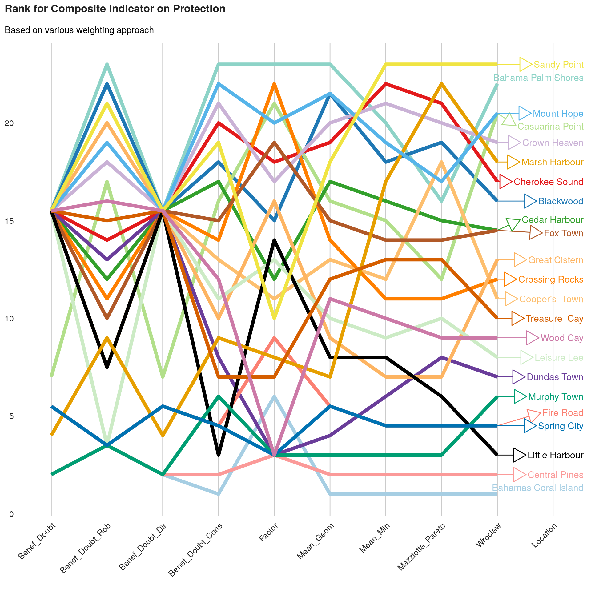
Index sensitivity to method
As we can see, the final ranking for each location is very sensitive to the methods.
An approach to select the method can be to identify, average ranks per method in order to identify the method that is getting closer this average ranks.
we can first visualise those average ranks.
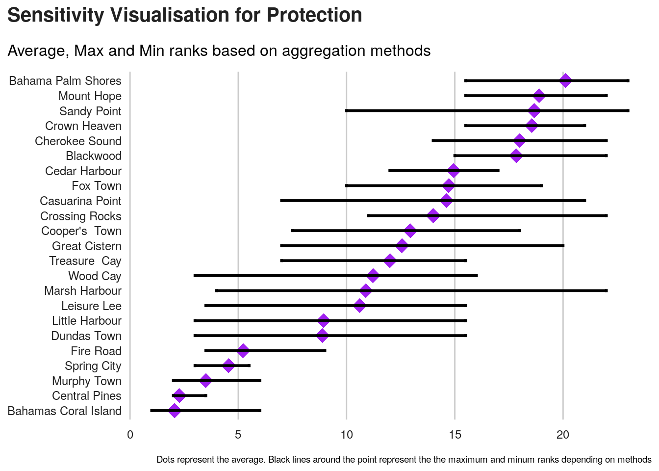
Next is to compute standard deviation for each method.
Severity Index on a map
We can now visualise the thematic indicator on a map.
First, let’s get the background map from OSM. This requires a bit of testing to have the correct background aligned with the map bounding box.
#plot(abaco)
# Create a boundary box
## https://www.openstreetmap.org/export#map=9/26.4226/-77.3259
longitudes <- c(-78.3, -76.3)
latitudes <- c(27.09, 25.75)
bounding_box <- SpatialPointsDataFrame( as.data.frame(cbind(longitudes, latitudes)),
                                        as.data.frame(cbind(longitudes, latitudes)) ,
                                        proj4string = CRS("+init=epsg:4326") )

# download osm tiles
abaco.osm <- getTiles(
   x = bounding_box,
   type = "osm",
   zoom = 11,
   crop = TRUE,
   verbose = FALSE
  )


#tilesLayer(x = abaco.osm)
Second step is to create a SpatialPointDataFrame with correct data and present it.
An initial visualisation will be to present both the severity and the population size affected by this severity.
## Creating a spatial Point data frame with coordinates
abaco <- SpatialPointsDataFrame(data[ ,c("C_103_lon","C_102_lat")], ## Coord
                                cbind(this.composite,
                                      data[ ,c("D_101_fams","D_102_inds","C_101_name")] ),  ## Composite with different algo - together with population
                                proj4string = CRS("+init=epsg:4326") ) ## Define projection syst


# get Map Background
tilesLayer(x = abaco.osm)
#Plot symbols with choropleth coloration
propSymbolsChoroLayer(
  spdf = abaco,
  var = "D_102_inds",
  inches = 0.25, ## size of the biggest symbol (radius for circles, width for squares, height for bars) in inches.
  border = "grey50",
  lwd = 1, #width of symbols borders.
  legend.var.pos = "topright",
  legend.var.title.txt = "Population Size\n(# of Individual)",
  var2 = this.var ,
  #classification method; one of "sd", "equal", "quantile", "fisher-jenks","q6", "geom", "arith", "em" or "msd"
  method = "quantile",
  nclass = 5,
  col = carto.pal(pal1 = "sand.pal", n1 = 6),
  #legend.var2.values.rnd = -2,
  legend.var2.pos = "left",
  legend.var2.title.txt = "Index Value\n",
  legend.var.style = "e"
)
# Layout
layoutLayer(title = paste0( "Severity  Index for ", this.dimension, " based on ",this.label ),
            author = "Protection Working Group, Abaco - The Bahamas, November 2019",
            sources = "Source: Key Informant Interview - HDX/DTM/IOM",
            tabtitle = TRUE,
            frame = FALSE ,
            bg = "#aad3df",
            scale = "auto")
# North arrow
north(pos = "topleft")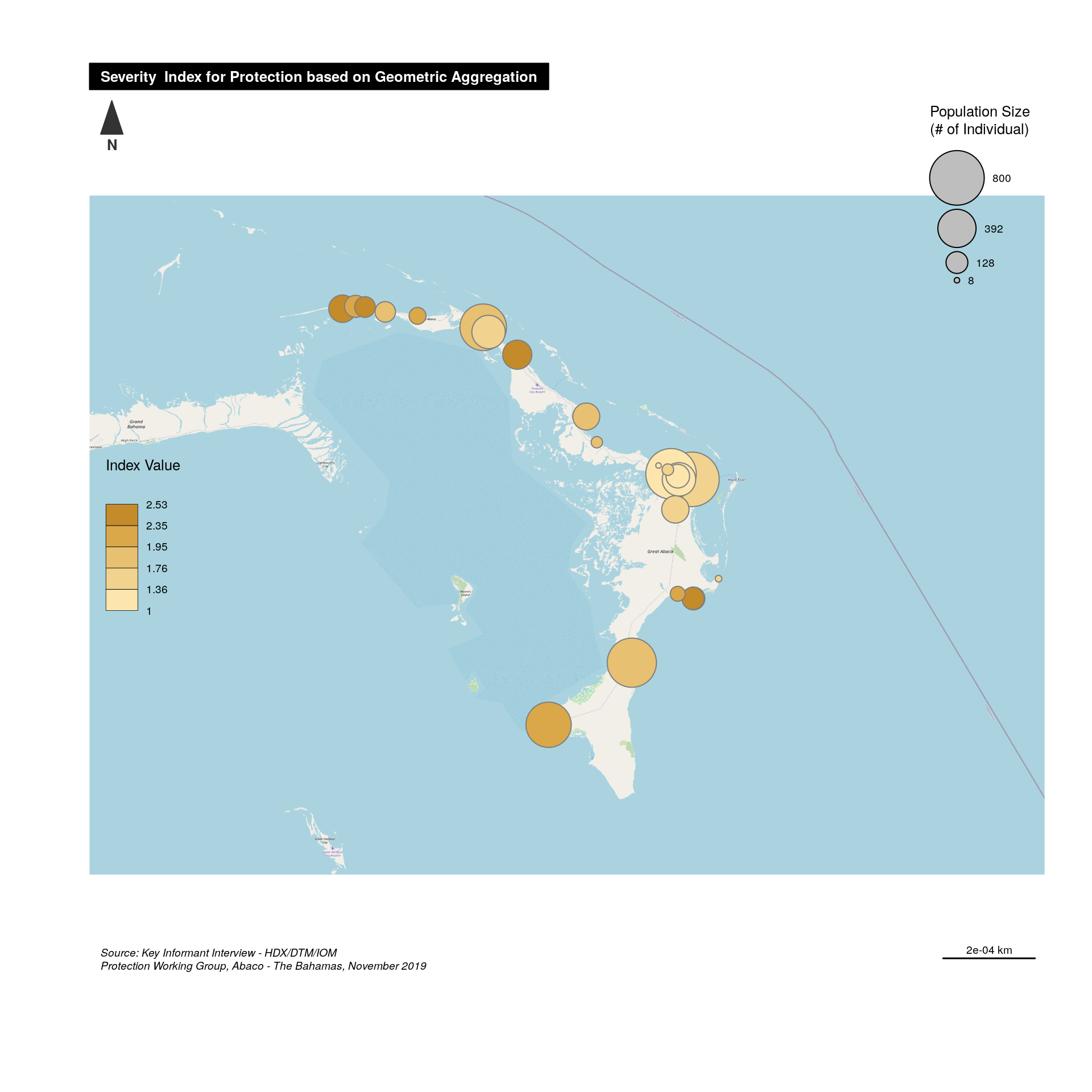
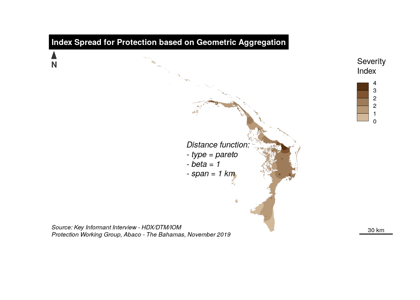
We can also try to present this information, using a smoothed map. For that we need to create first polygons based on points using the voronoi algorithm. Note that we use here the polygon mask for the island and that data are being re-projected (UTM-19N, i.e. epsg:32618) before producing the polygons.
## Prepare maps...

abacomask <- readOGR( paste0(getwd(),"/abaco.geojson"), verbose = FALSE)
abacomask <- spTransform(abacomask, CRS("+init=epsg:32618"))


## Create equivalent polygo with voronoi
# Using the union of points instead of the original sf object works:
voronoi <- st_voronoi(st_union(st_as_sf(spTransform(abaco, CRS("+init=epsg:32618")))))
# Clid boundary instead of the original island boundaries
abacopoly <- st_intersection(st_union(st_as_sf(abacomask)),
                             st_cast(voronoi))
abacopoly <- as(abacopoly, "Spatial")

rownames(abaco@data) <- NULL
abaco@data$ID <- rownames(abaco@data)
abacodata <- as.data.frame(abaco@data)
rownames(abacodata) <- paste0("ID",abaco$ID)
abacopoly <- SpatialPolygonsDataFrame(abacopoly, abacodata)
And now the smmoothed map - note the parameters: typefct, span and beta that requires a bit of testing for a correct visualisation.
Share this post
Twitter
Google+
Facebook
Reddit
LinkedIn
StumbleUpon
Pinterest
Email