Ratings and rankings account for the majority of data generated in the course of rapid key informant needs assessments during humanitarian emergencies. Using this information to develop consolidated need prioritisation comes with challenges.
Practically speaking, the method presented here can be used for dataset that includes questions such as
what’s your first need? (select_one among different options)
what’s your second need? (select_one among different options)
what’s your third need? (select_one among different options)
This tutorial is based on the publication Priorities and preferences in humanitarian needs assessments -Their measurement by rating and ranking methods and the article Modelling rankings in R: the PlackettLuce package .
Humanitarian needs assessments seek to establish priorities for action and preferences of those whom the action will affect. Assessment teams collect data meant to capture the severity of problems and the situational aspects that matter in the evaluation of response options. Needs assessments establish priorities whereas response plans seek viable compromises between priorities and the means to address them.
When samples of stakeholders, such as key informants or relief workers, state priorities or preferences, the information chiefly produces ratings or rankings and such data are ordinal. In summarizing them, we need to avoid operations that require metric variables (such as the arithmetic mean) wich does not account for compensability; yet we will seek methods that produce aggregates with metric qualities (such as Borda counts) as these have a higher information value and offer greater flexibility for subsequent prioritisation analyses.
When aggregating rating and ranking data and about the interpretation of the resulting measures of priority and preference, two distinctions are fundamental:
The first concerns statistical independence: Ratings (such as of the severity of unmet needs invarious sectors), though cognitively interdependent among items, statistically are independent. Rankings reflect an order among items and are dependent in both respects.For the analysis, both types have pros and cons; they contribute the most when used in tandem. This can happen during data collection – by asking both rating and ranking questions – and/or in the analysis – such as by ranking aggregate measures from ratings.
Second, certain measures characterize cases (units like geographical areas, communities,camps, eventually households and individuals), while others express relationships with items (formally: options, aspects, attributes, indicators; substantively: sectors, agencies,problems, etc.). Methods suitable to compare Case A vs. Case B as well as Item X vs. Y are few; most of those based on ordinal data work only in one or the other way, not both.
It is alsways good to recall that Ranking should be used only when the respondents can cognitively handle all the objectsat the same time. If the number of objects exceeds their memory and decisional capacity,the ensuing ranks will be incomplete or unreliable. If a complete ranking is desired, one possibility is to break the set of objects into subsets.
Problem statement
The simple visualisation of 3 variable Need1, Need2, Need3 does not allow to clear visualise priorities between needs. Borda count can be used to consolidate ranks. Though it implicitly makes a strong assumptions by implicitely accepting that respondents are aware that they exercise voting.
The Plackett-Luce model of rankings overcomes analysis barrier linked to the analysis of ranked preferences and priorities:
It produces a true ratio-level measure of the strength of preferences from full or partial choices.
It tests for differences between items follow from confidence intervals; so that such difference can be extended for groups within a given item.
The Plackett-Luce model supplies a stronger measure. It is ratio level. Moreover, it is basedon more intuitive behavioral assumptions than the Borda count.
In this tutorial, we will present code to implement quickly those 2 methods.
Loading packages & Function
## This function will retrieve the packae if they are not yet installed.
using <- function(...) {
    libs <- unlist(list(...))
    req <- unlist(lapply(libs,require,character.only = TRUE))
    need <- libs[req == FALSE]
    if (length(need) > 0) {
        install.packages(need)
        lapply(need,require,character.only = TRUE)
    }
}

## Getting all necessary package
using("foreign", "PlackettLuce", "tidyverse", "qvcalc","kableExtra","stargazer","NLP",
                     "ggthemes", "ggrepel", "GGally", "bbplot","ggpubr",'grid','gridExtra', 'forcat', 'psychotree')
## [[1]]
## [1] FALSErm(using)
# This small function is used to have nicely left align text within charts produced with ggplot2
left_align <- function(plot_name, pieces){
grob <- ggplot2::ggplotGrob(plot_name)
n <- length(pieces)
grob$layout$l[grob$layout$name %in% pieces] <- 2
return(grob)
}
## Fonction to calculate borda count
AvgRank <- function(BallotMatrix){
Ballots <- as.matrix(BallotMatrix[, -1], mode = "numeric")
Num_Candidates <- dim(Ballots)[1]
Names <- BallotMatrix[, 1]
Ballots[is.na(Ballots)] <- Num_Candidates + 1 #Treat blanks as one worse than min
MeanRanks <- rowMeans(Ballots)
Rankings <- data.frame(Names, MeanRanks)
Rankings <- Rankings[order(rank(Rankings[, 2], ties.method = "random")), ] #Ties handled through random draw
Rankings <- data.frame(Rankings, seq_along(Rankings[, 1]))
names(Rankings) <- c("Items", "Average Rank", "Position")
return(Rankings)
}
## Some ggplot2 style
kobo_unhcr_style_scatter <- function() {
font <- "Arial"
ggplot2::theme(
#This sets the font, size, type and colour of text for the chart's title
plot.title = ggplot2::element_text(family = font, size = 12, face = "bold", color = "#222222"),
#This sets the font, size, type and colour of text for the chart's subtitle, as well as setting a margin between the title and the subtitle
plot.subtitle = ggplot2::element_text(family = font, size = 11, margin = ggplot2::margin(9,0,9,0)),
plot.caption = ggplot2::element_blank(),
#This sets the position and alignment of the legend, removes a title and backround for it and sets the requirements for any text within the legend. The legend may often need some more manual tweaking when it comes to its exact position based on the plot coordinates.
legend.position = "top",
legend.text.align = 0,
legend.background = ggplot2::element_blank(),
legend.title = ggplot2::element_blank(),
legend.key = ggplot2::element_blank(),
legend.text = ggplot2::element_text(family = font, size = 9, color = "#222222"),
#This sets the text font, size and colour for the axis text, as well as setting the margins and removes lines and ticks. In some cases, axis lines and axis ticks are things we would want to have in the chart
axis.title = ggplot2::element_text(family = font, size = 11, color = "#222222"),
axis.text = ggplot2::element_text(family = font, size = 10, color = "#222222"),
#axis.text.x = ggplot2::element_text(margin = ggplot2::margin(5, b = 9)),
axis.ticks = ggplot2::element_blank(),
axis.line = ggplot2::element_blank(),
#This removes all minor gridlines and adds major y gridlines. In many cases you will want to change this to remove y gridlines and add x gridlines.
panel.grid.minor = ggplot2::element_blank(),
panel.grid.major.x = ggplot2::element_line(color = "#cbcbcb"),
panel.grid.major.y = ggplot2::element_line(color = "#cbcbcb"),
#This sets the panel background as blank, removing the standard grey ggplot background colour from the plot
panel.background = ggplot2::element_blank(),
#This sets the panel background for facet-wrapped plots to white, removing the standard grey ggplot background colour and sets the title size of the facet-wrap title to font size 22
strip.background = ggplot2::element_rect(fill = "white"),
strip.text = ggplot2::element_text(size = 11, hjust = 0)
)
}Dataset
The data used in the this tutorial comes from NPM Site Assessment Round 11, 2018 - for the Rohingya refugee camps in Bangladesh.
data_csv <- read.csv(file = "181227_2027AB_NPM11_Priorities_PlackettLuce.csv", header = T, sep = ",")

# Structure of the data:
#str(data_csv)
When loaded in R, all non-numeric data columns are read as factors when loading csv because of argument default.stringsAsFactors().
The model-fitting function in PlackettLuce, requires data in the form of rankings, with the rank (1st, 2nd, 3rd, …) for each item. Therefore transformation is required for the data in their orginal stage as we can see below.
used_var <- as.character(names(data_csv))[grepl("l_",as.character(names(data_csv)))]

 kable( data_csv[1:10 , c("block_id","population","priority1","priority2","priority3") ],
       caption = "Data Overview") %>%
kable_styling(bootstrap_options = c("striped", "bordered", "condensed", "responsive"), font_size = 9)| block_id | population | priority1 | priority2 | priority3 |
|---|---|---|---|---|
| CXB-001-001 | 40 | Food assistance | Cooking fuel and firewood | Job opportunities |
| CXB-005-001 | 129 | Cooking fuel and firewood | Job opportunities | Education for children |
| CXB-006-001 | 221 | Food assistance | Cooking fuel and firewood | Healthcare |
| CXB-007-001 | 130 | Food assistance | Sanitation | Education for children |
| CXB-008-001 | 112 | Food assistance | Cooking fuel and firewood | Healthcare |
| CXB-009-001 | 54 | Cooking fuel and firewood | Healthcare | Shelter |
| CXB-010-001 | 230 | Food assistance | Cooking fuel and firewood | Healthcare |
| CXB-013-001 | 106 | Food assistance | Cooking fuel and firewood | Sanitation |
| CXB-014-001 | 570 | Cooking fuel and firewood | Sanitation | Job opportunities |
| CXB-016-001 | 67 | Sanitation | Education for children | Healthcare |
We can visualise this all together. We fist need to sort all the 3 needs based on frequency of the first need using forcat package. Note that factor level are inverted as the bar chard will be then flipped.
data_csv$priority1 <- factor(data_csv$priority1, levels =  levels(fct_rev(fct_infreq(data_csv$priority1))))

data_csv$priority2 <- factor(data_csv$priority2, levels =  levels(fct_rev(fct_infreq(data_csv$priority1))))

data_csv$priority3 <- factor(data_csv$priority3, levels =  levels(fct_rev(fct_infreq(data_csv$priority1))))
plot1 <- ggplot(data = data_csv, aes( x = priority1)) +
geom_bar(fill = "#2a87c8",colour = "#2a87c8", stat = "count", width = .8) +
guides(fill = FALSE) +
#geom_label(aes(label = ..count.., y = ..count..), stat = "count", fill = "#2a87c8", color = 'white') +
geom_label(aes(label = priority1, y = 1), hjust = 0, vjust=0, fill = "#222222", color = 'white') +
coord_flip() +
xlab("Priority") +
ylab("") +
labs(title = "Main Needs",
subtitle = "First Priority") +
bbc_style() +
theme( plot.title = element_text(size = 13),
plot.subtitle = element_text(size = 11),
plot.caption = element_text(size = 7, hjust = 1),
axis.text = element_text(size = 10),
axis.text.y = element_blank(),
strip.text.x = element_text(size = 11),
panel.grid.major.x = element_line(color = "#cbcbcb"),
panel.grid.major.y = element_blank())
plot1 <- ggpubr::ggarrange(left_align(plot1, c("subtitle", "title", "caption")), ncol = 1, nrow = 1)
plot2 <- ggplot(data = data_csv, aes( x = priority2)) +
geom_bar(fill = "#2a87c8",colour = "#2a87c8", stat = "count", width = .8) +
guides(fill = FALSE) +
# geom_label(aes(label = ..count.., y = ..count..), stat = "count", fill = "#2a87c8", color = 'white') +
coord_flip() +
xlab("") +
ylab("") +
labs(title = "",
subtitle = "Second Priority") +
bbc_style() +
theme( plot.title = element_text(size = 13),
plot.subtitle = element_text(size = 11),
plot.caption = element_text(size = 7, hjust = 1),
axis.text = element_text(size = 10),
axis.text.y = element_blank(),
strip.text.x = element_text(size = 11),
panel.grid.major.x = element_line(color = "#cbcbcb"),
panel.grid.major.y = element_blank())
plot2 <- ggpubr::ggarrange(left_align(plot2, c("subtitle", "title")), ncol = 1, nrow = 1)
plot3 <- ggplot(data = data_csv, aes( x = priority3)) +
geom_bar(fill = "#2a87c8",colour = "#2a87c8", stat = "count", width = .8) +
guides(fill = FALSE) +
#geom_label(aes(label = ..count.., y = ..count..), stat = "count", fill = "#2a87c8", color = 'white') +
coord_flip() +
xlab("") +
ylab("") +
labs(title = "",
subtitle = "Third Priority") +
bbc_style() +
theme( plot.title = element_text(size = 13),
plot.subtitle = element_text(size = 11),
plot.caption = element_text(size = 7, hjust = 1),
axis.text = element_text(size = 10),
axis.text.y = element_blank(),
strip.text.x = element_text(size = 11),
panel.grid.major.x = element_line(color = "#cbcbcb"),
panel.grid.major.y = element_blank())
plot3 <- ggpubr::ggarrange(left_align(plot3, c("subtitle", "title")), ncol = 1, nrow = 1)
grid.arrange( plot1, plot2, plot3, ncol = 3)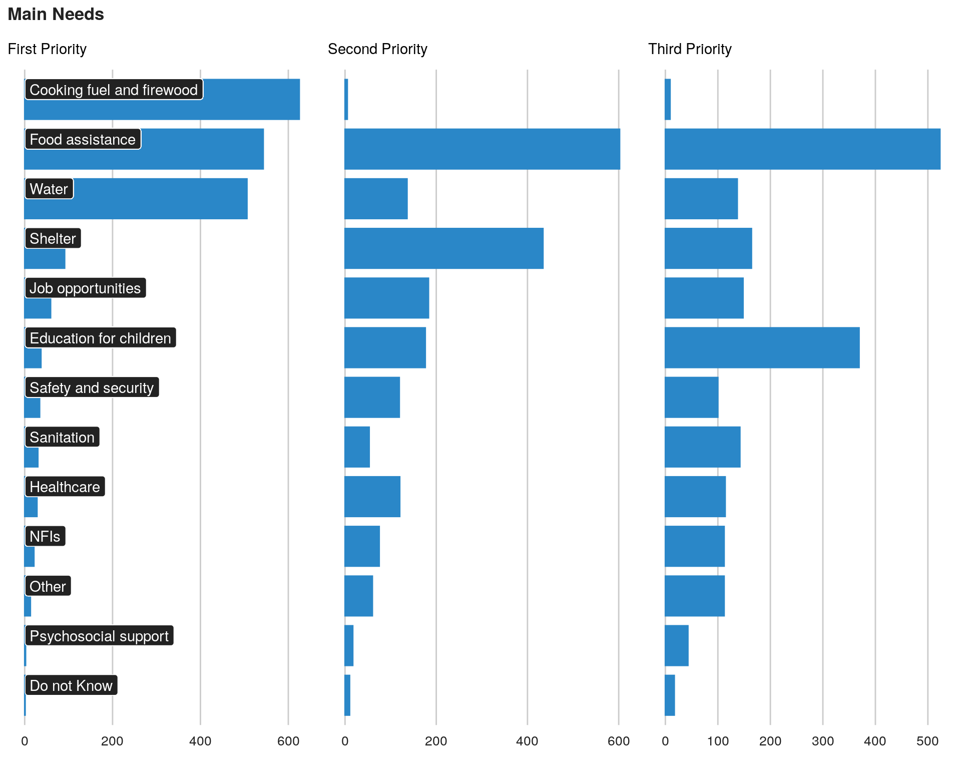
The analysis will provide estimates for priorities among 10 areas of need extracted from those 3 variables.
    ## thanks to: https://stackoverflow.com/questions/44232180/list-to-dataframe
    # tosplitlist <- strsplit(as.character(data[ , id]), " ")
    # tosplitlist <- stats::setNames(tosplitlist, seq_along(tosplitlist))
    # tosplitlist2 <- utils::stack(tosplitlist)
    # tosplitframe <- reshape2::dcast(tosplitlist2, ind ~ values, value.var = "ind", fun.aggregate = length)
Arguments to be used the Plackett-Luce model have been prefixed “l_” so that they can retrieved automatically.
Borda Count
## transpose the data

vote <- t(data_csv[ , c(used_var)])

borda <- AvgRank(vote)

borda$Items <- row.names(borda)
row.names(borda) <- NULL

kable( borda,
       caption = "Borda Count per sector") %>%
kable_styling(bootstrap_options = c("striped", "bordered", "condensed", "responsive"), font_size = 9)| Items | Average Rank | Position |
|---|---|---|
| l_nfis | 0.2398190 | 1 |
| l_healthcare | 0.2584213 | 2 |
| l_safety | 0.2845651 | 3 |
| l_education | 0.2890900 | 4 |
| l_sanitation | 0.3076923 | 5 |
| l_shelter | 0.4529915 | 6 |
| l_food | 0.6158874 | 7 |
| l_jobs | 0.7616893 | 8 |
| l_water | 0.9381599 | 9 |
| l_fuel | 1.7073906 | 10 |
We can visualise this all together
borda$items <- gsub(pattern     = "l_",
                    replacement = "",
                    borda$Items)

plot1 <- ggplot(data = borda, aes( x = reorder( items, borda[ ,2]), ## Reordering country by Value
                         y = borda[ ,2])) +
  geom_bar(fill = "#2a87c8", colour = "#2a87c8",
           stat = "identity") +
  coord_flip() +
  scale_y_continuous( ) + ## Format axis number
  guides(fill = FALSE) +
  xlab("") +
  ylab("Priority average Rank") +
  labs(title = "Main Needs according to Borda Count") +
  bbc_style() +
  theme( plot.title = element_text(size = 14),
         plot.subtitle = element_text(size = 12),
         plot.caption = element_text(size = 7, hjust = 1),
         axis.text = element_text(size = 9),
         panel.grid.major.x = element_line(color = "#cbcbcb"),
         panel.grid.major.y = element_blank(),
         strip.text.x = element_text(size = 11))

ggpubr::ggarrange(left_align(plot1, c("subtitle", "title", "caption")), ncol = 1, nrow = 1)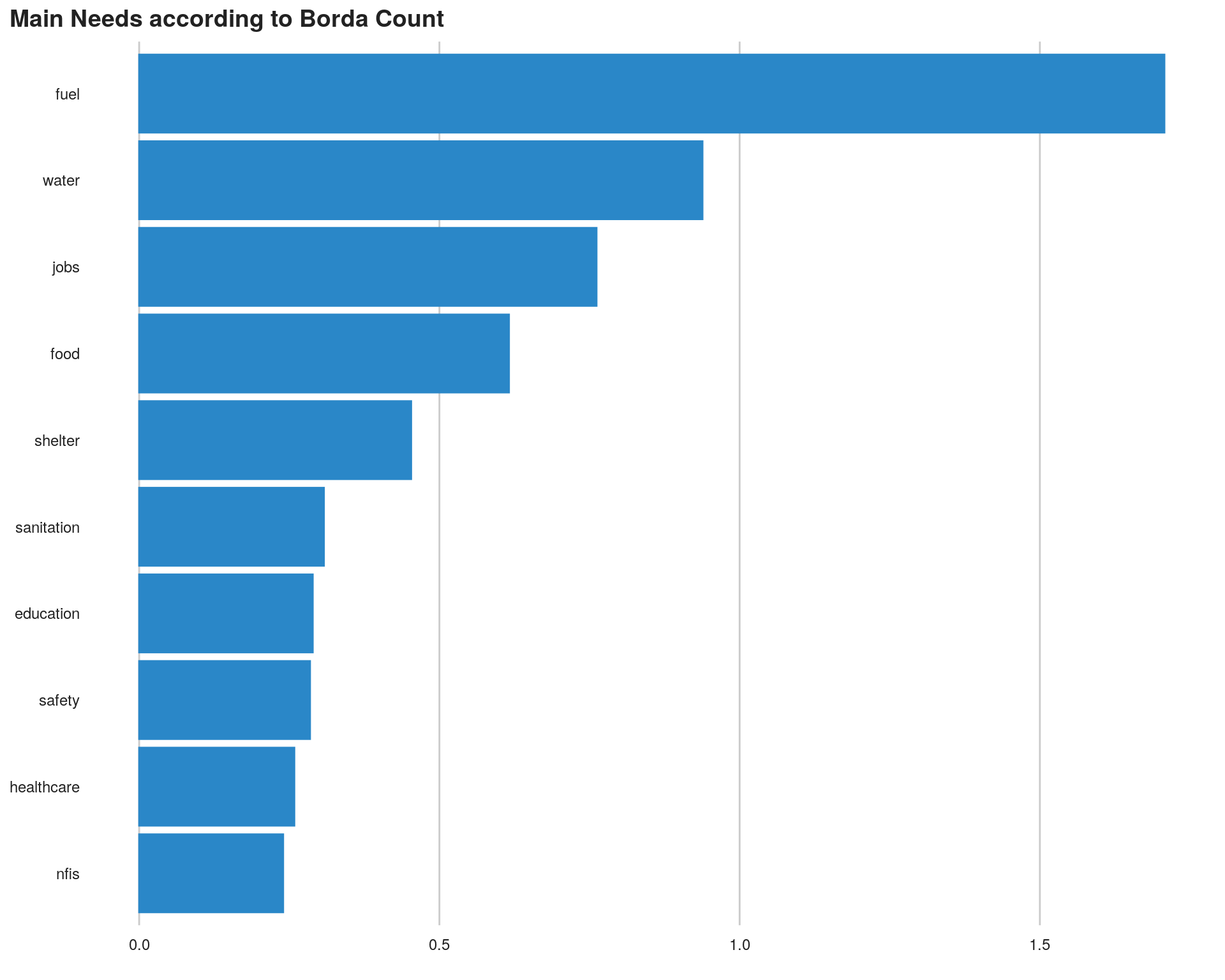
Plackett-Luce Model
Generate the model
In the needs assessment context, we call the Plackett-Luce-“worth” coefficients “Intensities”; this terminology is arbitrary. Error messages below will apppear but are specific of this dataset and can be ignored.
data_csv %>%
  dplyr::select(starts_with("l_")) %>%
  PlackettLuce() -> intensities
## Recoded rankings that are not in dense form## Rankings with only 1 item set to `NA`#names(intensities)
# Summary of intensities:
# "ref = NULL" sets the mean of all intensities as the reference value.
# Else the first item would be the reference, with its coefficent constrained to 0.
Plackett_Luce_est <- summary(intensities, ref = NULL)
Plackett_Luce_est## Call: PlackettLuce(rankings = .)
##
## Coefficients:
## Estimate Std. Error z value Pr(>|z|)
## l_fuel 0.40822 0.04211 9.694 < 2e-16 ***
## l_education -0.05125 0.09615 -0.533 0.5940
## l_food 1.45591 0.06502 22.393 < 2e-16 ***
## l_healthcare -0.50588 0.11155 -4.535 5.76e-06 ***
## l_jobs -0.74085 0.07239 -10.235 < 2e-16 ***
## l_nfis -0.75151 0.12079 -6.221 4.93e-10 ***
## l_safety -0.75632 0.11546 -6.550 5.74e-11 ***
## l_sanitation -0.17088 0.09585 -1.783 0.0746 .
## l_shelter 0.06927 0.07656 0.905 0.3656
## l_water 1.04329 0.05337 19.550 < 2e-16 ***
## ---
## Signif. codes: 0 '***' 0.001 '**' 0.01 '*' 0.05 '.' 0.1 ' ' 1
##
## Residual deviance: 5912.8 on 5729 degrees of freedom
## AIC: 5930.8
## Number of iterations: 17Preparations for confidence intervals
First, we prepare a table for export, stripping the prefix “l_”. We ensure items will be listed in the sequence of the arguments, not alphabetically.
Plackett_Luce_est$coefficients %>%
  gsub(pattern     = "l_",
       replacement = "",
       x           = row.names(.)) %>%
  factor(x = ., levels = .) -> items
data.frame(items_num = as.integer(items),
           items     = items,
           Plackett_Luce_est$coefficients) -> Plackett_Luce_est_z.values

kable(Plackett_Luce_est_z.values, caption = "Model estimation") %>%
kable_styling(bootstrap_options = c("striped", "bordered", "condensed", "responsive"), font_size = 9)| items_num | items | Estimate | Std..Error | z.value | Pr…z.. | |
|---|---|---|---|---|---|---|
| l_fuel | 1 | fuel | 0.4082170 | 0.0421095 | 9.6941844 | 0.0000000 |
| l_education | 2 | education | -0.0512509 | 0.0961501 | -0.5330300 | 0.5940128 |
| l_food | 3 | food | 1.4559099 | 0.0650167 | 22.3928506 | 0.0000000 |
| l_healthcare | 4 | healthcare | -0.5058790 | 0.1115519 | -4.5349226 | 0.0000058 |
| l_jobs | 5 | jobs | -0.7408503 | 0.0723857 | -10.2347628 | 0.0000000 |
| l_nfis | 6 | nfis | -0.7515089 | 0.1207942 | -6.2213973 | 0.0000000 |
| l_safety | 7 | safety | -0.7563186 | 0.1154639 | -6.5502617 | 0.0000000 |
| l_sanitation | 8 | sanitation | -0.1708777 | 0.0958493 | -1.7827746 | 0.0746230 |
| l_shelter | 9 | shelter | 0.0692724 | 0.0765627 | 0.9047796 | 0.3655822 |
| l_water | 10 | water | 1.0432861 | 0.0533651 | 19.5499757 | 0.0000000 |
# ========================================================================
# Export output: if needed
# ------------------------------------------------------------------------
# write.csv(x         = Plackett_Luce_est_z.values,
#           file      = paste0(path.output, "/", "Plackett_Luce_coef_table.csv"),
#           row.names = F)
In order to obtain confidence intervals, quasi-variances of the coefficients are needed:
qv <- qvcalc(intensities, ref = NULL)
summary(qv)
## Model call: PlackettLuce(rankings = .)
## estimate SE quasiSE quasiVar
## l_fuel 0.40821699 0.04210947 0.03288481 0.001081411
## l_education -0.05125089 0.09615010 0.10275089 0.010557745
## l_food 1.45590988 0.06501673 0.06142255 0.003772729
## l_healthcare -0.50587901 0.11155185 0.12108662 0.014661971
## l_jobs -0.74085027 0.07238568 0.07490996 0.005611502
## l_nfis -0.75150887 0.12079423 0.13156000 0.017308034
## l_safety -0.75631864 0.11546388 0.12518339 0.015670881
## l_sanitation -0.17087771 0.09584931 0.10267997 0.010543176
## l_shelter 0.06927241 0.07656274 0.07906022 0.006250518
## l_water 1.04328611 0.05336508 0.04693406 0.002202806
## Worst relative errors in SEs of simple contrasts (%): -2.9 6.4
## Worst relative errors over *all* contrasts (%): -11.3 7.8#plot(qv, xlab = "Needs Priorities", ylab = "Worth (log)", main = NULL)We strips prefix “l_” in preparation for export and ensure that items will be listed in the sequence of the arguments, not alphabetically.
qv$qvframe %>%
  gsub(pattern     = "l_",
       replacement = "",
       x           = row.names(.)) %>%
  factor(x = ., levels = .) -> items
Now we computes additional columns needed for 95%-CIs and exponentiate coefficent and CI bound estimates, in accordance with Plackett-Luce Model.
qv$qvframe %>% # qv table ...
  data.frame(items_num = as.integer(items),
             items     = items,
             .) %>%
  mutate(quasiSD  = sqrt(quasiVar),
         quasiLCI = estimate - quasiSD * qnorm(0.975, 0, 1),
         quasiUCI = estimate + quasiSD * qnorm(0.975, 0, 1),
         expLCI   = exp(quasiLCI),
         expEst   = exp(estimate),
         expUCI   = exp(quasiUCI)) -> qv_estim_CI

## Sort based on preference level
qv_estim_CI <- qv_estim_CI[ order(-  qv_estim_CI$expEst), ]
qv_estim_CI$items <- reorder(qv_estim_CI$items, qv_estim_CI$expEst)


kable(qv_estim_CI, caption = "Model Confidence Interval") %>%
kable_styling(bootstrap_options = c("striped", "bordered", "condensed", "responsive"), font_size = 9)| items_num | items | estimate | SE | quasiSE | quasiVar | quasiSD | quasiLCI | quasiUCI | expLCI | expEst | expUCI | |
|---|---|---|---|---|---|---|---|---|---|---|---|---|
| 3 | 3 | food | 1.4559099 | 0.0650167 | 0.0614225 | 0.0037727 | 0.0614225 | 1.3355239 | 1.5762959 | 3.8019873 | 4.2883836 | 4.8370056 |
| 10 | 10 | water | 1.0432861 | 0.0533651 | 0.0469341 | 0.0022028 | 0.0469341 | 0.9512970 | 1.1352752 | 2.5890656 | 2.8385294 | 3.1120298 |
| 1 | 1 | fuel | 0.4082170 | 0.0421095 | 0.0328848 | 0.0010814 | 0.0328848 | 0.3437639 | 0.4726700 | 1.4102457 | 1.5041335 | 1.6042719 |
| 9 | 9 | shelter | 0.0692724 | 0.0765627 | 0.0790602 | 0.0062505 | 0.0790602 | -0.0856828 | 0.2242276 | 0.9178854 | 1.0717281 | 1.2513558 |
| 2 | 2 | education | -0.0512509 | 0.0961501 | 0.1027509 | 0.0105577 | 0.1027509 | -0.2526389 | 0.1501372 | 0.7767483 | 0.9500403 | 1.1619936 |
| 8 | 8 | sanitation | -0.1708777 | 0.0958493 | 0.1026800 | 0.0105432 | 0.1026800 | -0.3721268 | 0.0303713 | 0.6892669 | 0.8429246 | 1.0308372 |
| 4 | 4 | healthcare | -0.5058790 | 0.1115519 | 0.1210866 | 0.0146620 | 0.1210866 | -0.7432044 | -0.2685536 | 0.4755875 | 0.6029753 | 0.7644845 |
| 5 | 5 | jobs | -0.7408503 | 0.0723857 | 0.0749100 | 0.0056115 | 0.0749100 | -0.8876711 | -0.5940294 | 0.4116132 | 0.4767084 | 0.5520982 |
| 6 | 6 | nfis | -0.7515089 | 0.1207942 | 0.1315600 | 0.0173080 | 0.1315600 | -1.0093617 | -0.4936560 | 0.3644515 | 0.4716544 | 0.6103907 |
| 7 | 7 | safety | -0.7563186 | 0.1154639 | 0.1251834 | 0.0156709 | 0.1251834 | -1.0016736 | -0.5109637 | 0.3672643 | 0.4693912 | 0.5999172 |
#str(qv_estim_CI)
# ========================================================================
# Export output:
# ------------------------------------------------------------------------
# write.csv(x         = qv_estim_CI,
#           file      = paste0(path.output, "/", "Plackett_Luce_estimates_CI.csv"),
#           row.names = F)
Visualise Results
In order to visualise the results together with the confidence interval, the best type visual is called a Forest plot.
There’s a default plot in PlackettLuce package but we can also use ggplot2.
plot1 <- ggplot(data = qv_estim_CI,
             aes( x = items,
                  y = expEst,
                  ymin = expLCI,
                  ymax = expUCI)) +
      # geom_pointrange(color = "purple", shape = 18,  size = 2) +

        geom_point(color = "purple", shape = 18,  size = 5) +
        geom_errorbar(aes(xmax = expLCI, xmin = expLCI), height = 1, color = "black", width = 0.2, size = 1) +

        #geom_hline(yintercept = 1, lty = 2) +  # add a dotted line at x=1 after flip
        coord_flip() +  # flip coordinates (puts labels on y axis)
        xlab("Preference Level") +
        ylab("") +
        labs(title = " At first: Food, Water & Fuel!",
                 subtitle =  "Sectorial Preference, analysis based on Plackett-Luce model",
                 caption = "The black lines (also called 'whiskers') around the point represent the confidence interval for each sector (the shorter the line, the more precise is the estimate)") +
          bbc_style() +
            theme( plot.title = element_text(size = 14),
                   plot.subtitle = element_text(size = 12),
                   plot.caption = element_text(size = 7, hjust = 1),
                  axis.text = element_text(size = 9),
                  panel.grid.major.x = element_line(color = "#cbcbcb"),
                  panel.grid.major.y = element_blank(),
                  strip.text.x = element_text(size = 11))

ggpubr::ggarrange(left_align(plot1, c("subtitle", "title", "caption")), ncol = 1, nrow = 1)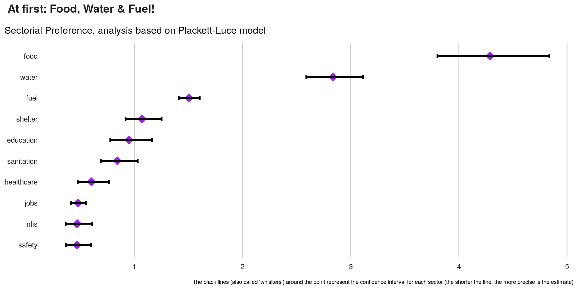
Compare Borda Count & Plackett-Luce Model
Plackett-Luce does not score observed ranks mechanically, as Borda does. Rather, it considers the tendency for items to be at the higher end of the observed ranks and then extrapolates that information into simulated rankings of the unobserved ranks.
The Borda count is indifferent to the unobserved rank orders. It is uninformative in this regard.
We can compare the 2 method with the chart below:
Note the usage of ggrepel to avoid having overlaping labels.
compare <- merge( x = qv_estim_CI, y = borda, by = "items")

plot1 <- ggplot(data = compare, aes(x = compare[ ,14], y = expEst)) +
  geom_point(shape = 1) +    # Use hollow circles
  # geom_smooth()  +          # Add a loess smoothed fit curve with confidence region
  geom_label_repel(aes(label = items), size = 5) +
  xlab("Preference Level - Borda") +
  ylab("Preference Level - Plackett-Luce") +
  labs(title = "Comparing Needs Prioritisation",
       subtitle =  "Food or Fuel? It depends on how you count it...") +
  kobo_unhcr_style_scatter() +
  theme( plot.title = element_text(size = 14),
         plot.subtitle = element_text(size = 12),
         plot.caption = element_text(size = 7, hjust = 1),
         axis.text = element_text(size = 9),
         panel.grid.major.x = element_line(color = "#cbcbcb"),
         panel.grid.major.y = element_line(color = "#cbcbcb"),
         strip.text.x = element_text(size = 11))

ggpubr::ggarrange(left_align(plot1, c("subtitle", "title")), ncol = 1, nrow = 1)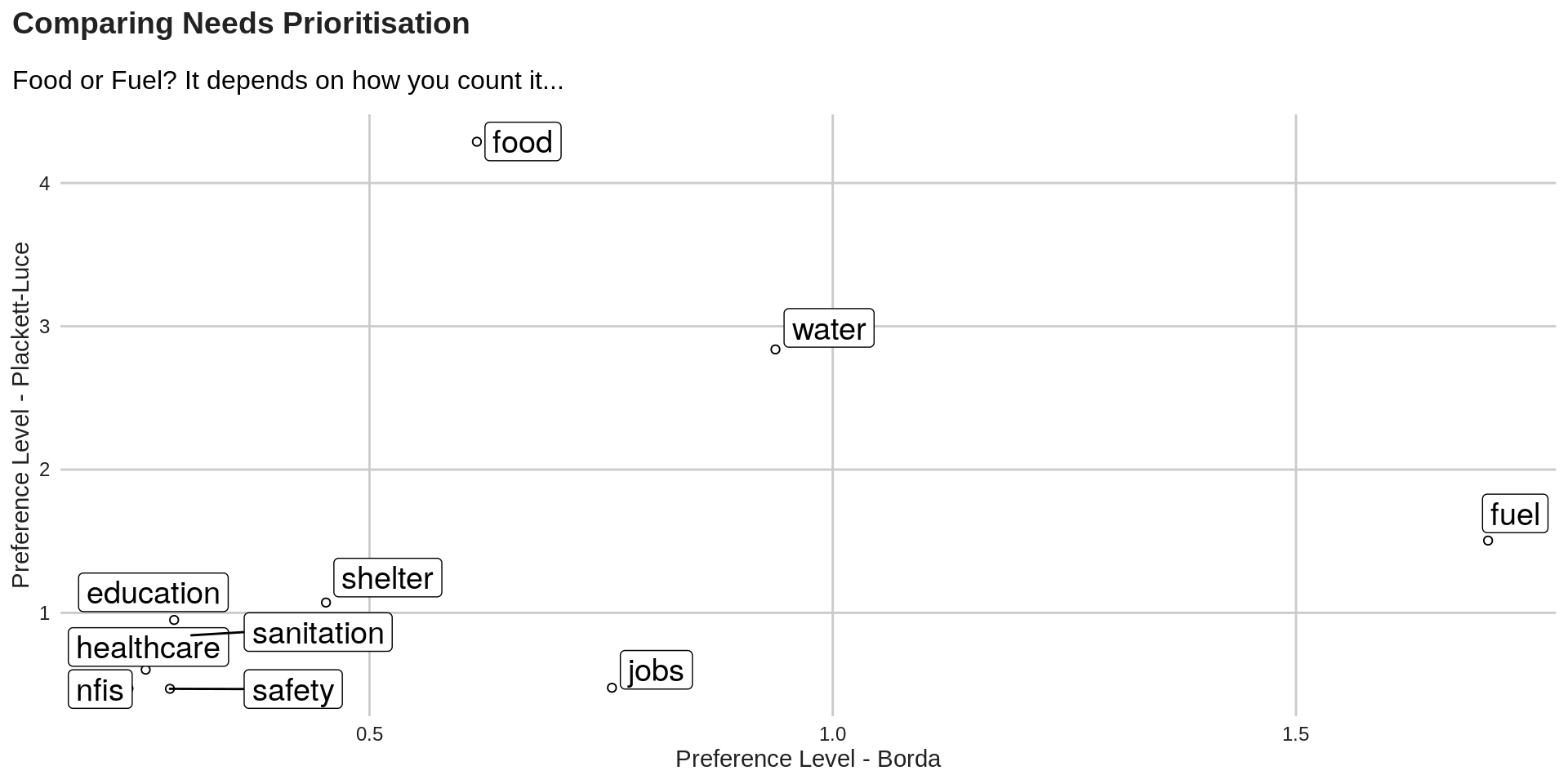
Share this post
Twitter
Google+
Facebook
Reddit
LinkedIn
StumbleUpon
Pinterest
Email